
The Department of Mathematics and Science Education
tiffani c. knight
I chose to use the
Stamps data to generate a prediction from the data given from the
spreadsheet.
|
year |
rate(in cents) |
|
|
|
|
1919 |
2 |
|
1932 |
3 |
|
1958 |
4 |
|
1963 |
5 |
|
1968 |
6 |
|
1971 |
8 |
|
1974 |
10 |
|
1975 |
13 |
|
1978 |
15 |
|
1981 |
20 |
|
1985 |
22 |
|
1988 |
25 |
|
1991 |
29 |
|
1994 |
32 |
|
1997 |
33 |
|
1999 |
34 |
|
2002 |
37 |
2006
39
As you can see, we
were given data on the price of stamps from 1919 until 2002. It’s 2006 now and stamps cost 39 cents,
so that’s some information we can add.
Alright, let’s see if I can see a pattern…it increased 1 cent in thirteen
years, then 1 cent in twenty six years, then 1 cent in five years, then 1 cent
in another 5 years, 2 cents in three years, another 2 cents in three more
years, 3 cents in one year, 2 cents in three years, 5 cents in three years, 2
cents in four years, 3 cents in three years, 4 cents in three years, 3 cents in
3 years, 1 cent in three years, 1 cent in two years, 3 cents in 3 years, and
finally, 1 cent in the last 4 years.
That just looks
like a whole lotta words to me.
Stamps were only 2 cents back in 1919! I had no clued.
Let’s see, they cost 15 cents when I was born and ten cents more when my
younger sister was born…guesses as to what year she was born?
Okay, lets get a
graph…these words are too much. And
I am such a visual person. I used excel to create this masterpiece:
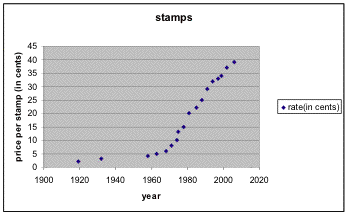
Well, from this
graph alone, it’s easy to see that the cost of stamps rise as the years go on
and that is due to a lot of different things, I’m sure…but I won’t get into
those possible reasons.
Now, I’ve graphed
the relationship of an observation, now I have to generate a function and make
a prediction as to when the cost of a first class postage stamp will reach a
buck ($1.00), $0.64, and when the next 3 cent increase can be expected.
Okay, I was told
that I needed to add a trendline and a function. I had no idea how to do this because I’ve never done it
before. So I went to the help
option on Microsoft and searched how to add a trendline. The directions were easy to follow, and
I think I did it correctly, this is what I got:
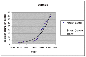
It looked fine to
me, so I moved on to trying to add a function…and that wasn’t so easy. I read and read, but it didn’t help
much. So, I followed the
instructions as best I could. I
filled in a few years and then used the fill thingy to create a few more years
in my data. Then I selected all of
the data from the cost per stamp, and used the right mouse button to fill in
costs. This is my result:
|
year |
rate(in cents) |
|
|
|
|
1919 |
2 |
|
1932 |
3 |
|
1958 |
4 |
|
1963 |
5 |
|
1968 |
6 |
|
1971 |
8 |
|
1974 |
10 |
|
1975 |
13 |
|
1978 |
15 |
|
1981 |
20 |
|
1985 |
22 |
|
1988 |
25 |
|
1991 |
29 |
|
1994 |
32 |
|
1997 |
33 |
|
1999 |
34 |
|
2002 |
37 |
|
2006 |
39 |
|
2007 |
41.51633987 |
|
2008 |
43.91572067 |
|
2009 |
46.31510148 |
|
2010 |
48.71448228 |
|
2011 |
51.11386309 |
|
2012 |
53.51324389 |
|
2013 |
55.9126247 |
|
2014 |
58.3120055 |
|
2015 |
60.71138631 |
|
2016 |
63.11076711 |
|
2017 |
65.51014792 |
|
2018 |
67.90952872 |
|
2019 |
70.30890953 |
|
2020 |
72.70829033 |
|
2021 |
75.10767114 |
|
2022 |
77.50705194 |
|
2023 |
79.90643275 |
|
2024 |
82.30581355 |
|
2025 |
84.70519436 |
|
2026 |
87.10457516 |
|
2027 |
89.50395597 |
|
2028 |
91.90333677 |
|
2029 |
94.30271758 |
|
2030 |
96.70209838 |
|
2031 |
99.10147919 |
|
2032 |
101.50086 |
|
2033 |
103.9002408 |
|
2034 |
106.2996216 |
|
2035 |
108.6990024 |
|
2036 |
111.0983832 |
|
2037 |
113.497764 |
Now, I guess I’m
ready to answer the questions.
From my data, the cost of a stamp will reach a buck in about the year
2032 and 64 cents in about the year 2017.
Finally, we can expect to see the next 3 cent increase in the year 2010.