Explorations with
spreadsheets
By: Diana Brown
This exploration is from data that
is based on the first class letter postage for the US Mail from 1933 to 1996.
The Data
|
year |
rate(in cents) |
|
1919 |
2 |
|
1932 |
3 |
|
1958 |
4 |
|
1963 |
5 |
|
1968 |
6 |
|
1971 |
8 |
|
1974 |
10 |
|
1975 |
13 |
|
1978 |
15 |
|
1981 |
20 |
|
1985 |
22 |
|
1988 |
25 |
|
1991 |
29 |
|
1994 |
32 |
|
1997 |
33 |
|
1999 |
34 |
|
2002 |
37 |
The Graph of the data using
Microsoft Office Excel
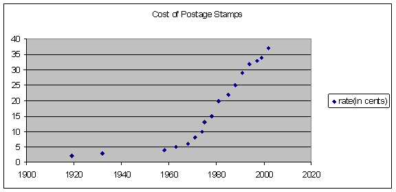
Notice the graph looks like an
exponential function.
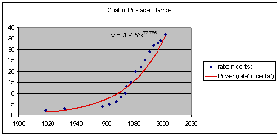
Here is a graph of the data with a
predicted function and equation when I created the best fit equation
Some predictions for the future:
When will the cost be 64 cents? When will the cost of a first class
postage stamp reach $1.00? How soon
should we expect the next 3 cent increase?
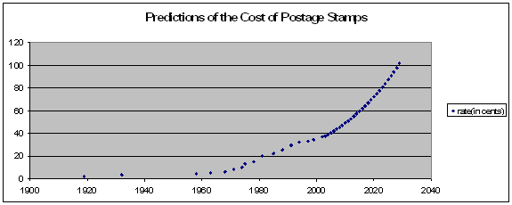
Let’s extend the data in the table
using the equation from above:
|
year |
rate(in cents) |
|
1919 |
2 |
|
1932 |
3 |
|
1958 |
4 |
|
1963 |
5 |
|
1968 |
6 |
|
1971 |
8 |
|
1974 |
10 |
|
1975 |
13 |
|
1978 |
15 |
|
1981 |
20 |
|
1985 |
22 |
|
1988 |
25 |
|
1991 |
29 |
|
1994 |
32 |
|
1997 |
33 |
|
1999 |
34 |
|
2002 |
37 |
|
2003 |
37 |
|
2004 |
39 |
|
2005 |
40 |
|
2006 |
42 |
|
2007 |
43 |
|
2008 |
45 |
|
2009 |
47 |
|
2010 |
49 |
|
2011 |
51 |
|
2012 |
53 |
|
2013 |
55 |
|
2014 |
57 |
|
2015 |
59 |
|
2016 |
62 |
|
2017 |
64 |
|
2018 |
66 |
|
2019 |
69 |
|
2020 |
72 |
|
2021 |
75 |
|
2022 |
78 |
|
2023 |
81 |
|
2024 |
84 |
|
2025 |
87 |
|
2026 |
90 |
|
2027 |
94 |
|
2028 |
98 |
|
2029 |
101 |
Notice that in the year 2017 the
price of stamps will be around 64 cents and around 2029 the price will be
$1.00.
The graph of the extended data
Click Here
for Excel Spreadsheet File