Final
Assignment – Part 2.C
Stamp Data
by
Victor L. Brunaud-Vega
|
|
Consider
the Stamp Problem in Assignment 12.
Update the data to include the price increases for a first class
letter through January 2006 - when the price will become 39 cents. (Recent increases
were 33 cents in 1997, 34 cents in 1999 and 37 cents in 2002.) Prepare a
write-up and use your analysis to answer the questions a new: ·
When will the cost of a first class postage stamp reach $1.00? ·
When will the cost be 74 cents? ·
How soon should we expect the next increase? ·
In 1996, the analysis of stamp data historically seemed to show
that the postage doubled every 10 years approximately. The cost in 2006 would
seem to argue that pattern is no longer valid. Is there evidence to show a change in the growth pattern?
Or, was the 'doubles every ten years' just a bad model? |
|
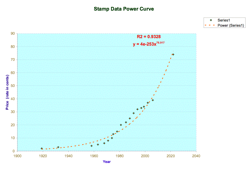
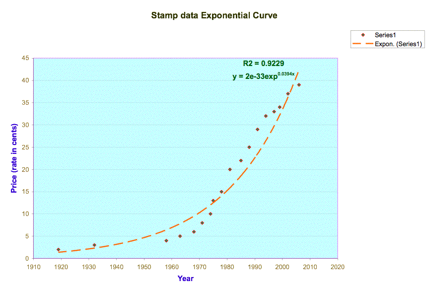
My first attempt was graph the data. Then I thought that the curve might be close to a power or
an exponential function. But just
watching the scatter plot of the data, I cannot say if the curve follows either
a power or an exponential function.
However, using the coefficient of correlation (R2) between
the variables maybe I can find how well the variables are related and then
realize what curve is the best fit for the data.


The coefficient of correlation values in both graphics are pretty
close: 0.923 for exponential curve, and 0.933 for power curve. As the difference is not big enough, I
think I can choose either one for predicting other values because both will be
equally good predictors.
Let’s see how close are the outcomes using both equations in the
following table:
|
x=Year |
y=Price (rate in cents) |
Exponential
Function
y=2E-33e^0.0394 |
Power
Function
y=4E-253*x^76.917 |
||
|
Year Prediction |
Price Prediction
|
Year Prediction |
Price Prediction |
||
|
1919 |
2 |
1919 |
1.4 |
1929 |
1.3 |
|
1932 |
3 |
1929 |
2.3 |
1939 |
2.2 |
|
1958 |
4 |
1936 |
6.4 |
1947 |
6.3 |
|
1963 |
5 |
1942 |
7.8 |
1952 |
7.6 |
|
1968 |
6 |
1947 |
9.5 |
1957 |
9.3 |
|
1971 |
8 |
1954 |
10.6 |
1964 |
10.5 |
|
1974 |
10 |
1959 |
12.0 |
1970 |
11.8 |
|
1975 |
13 |
1966 |
12.5 |
1977 |
12.2 |
|
1978 |
15 |
1970 |
14.0 |
1980 |
13.7 |
|
1981 |
20 |
1977 |
15.8 |
1988 |
15.4 |
|
1985 |
22 |
1979 |
18.5 |
1990 |
18.0 |
|
1988 |
25 |
1983 |
20.8 |
1993 |
20.2 |
|
1991 |
29 |
1986 |
23.4 |
1997 |
22.7 |
|
1994 |
32 |
1989 |
26.3 |
2000 |
25.5 |
|
1997 |
33 |
1990 |
29.7 |
2001 |
28.7 |
|
1999 |
34 |
1990 |
32.1 |
2001 |
31.0 |
|
2002 |
37 |
1993 |
36.1 |
2004 |
34.7 |
|
2006 |
39 |
1994 |
42.3 |
2005 |
40.5 |
|
2022 |
74 |
2010 |
79.4 |
2022 |
74.6 |
|
2029 |
100 |
2018 |
104.6 |
2030 |
97.3 |
I chose the power curve as predictor because is a little
bigger. The equation for
this curve is y = 4-253 x76.917, where x represents the
year and y represents the price (rate in cents).
To know when the price will reach 1.00 dollar, we can replace y by 100 cents and
then find the new value of x.
So, now 100 = 4-253 ● x76.917
x = (100 / 4-253) 76.917
and x = 2030. This means that the stamp will cost a
dollar the year 2030. Of course,
this is an approximate value.
The same can be done to find the year in which the stamp will cost
74 cents. So, now 74 = 4-253 ● x76.917
x = (74 / 4-253) 76.917
and x = 2022. This means that the stamp will cost 74
cents the year 2022.
Remember that these values are approximate.
Are there significant differences if I use power function or
exponential function? We can see
in trhe next chart that the difference in price is very small between them
(some cents) and some years were predicted exactly similar. The cells highlighted are the cells
where there was any difference.
Table 1
|
Year |
Price |
Exponential Function
|
Power Function |
||
|
Prediction
price using equation |
Predictions
year using equation |
Prediction
price using equation |
Prediction year using equation |
||
|
1919 |
2 |
1.37 |
1929 |
1.34 |
1929 |
|
1932 |
3 |
2.29 |
1939 |
2.25 |
1939 |
|
1958 |
4 |
6.38 |
1946 |
6.29 |
1947 |
|
1963 |
5 |
7.77 |
1952 |
7.65 |
1952 |
|
1968 |
6 |
9.46 |
1956 |
9.30 |
1957 |
|
1971 |
8 |
10.65 |
1964 |
10.46 |
1964 |
|
1974 |
10 |
11.98 |
1969 |
11.76 |
1970 |
|
1975 |
13 |
12.46 |
1976 |
12.22 |
1977 |
|
1978 |
15 |
14.03 |
1980 |
13.74 |
1980 |
|
1981 |
20 |
15.79 |
1987 |
15.44 |
1988 |
|
1985 |
22 |
18.48 |
1989 |
18.03 |
1990 |
|
1988 |
25 |
20.80 |
1993 |
20.25 |
1993 |
|
1991 |
29 |
23.41 |
1996 |
22.74 |
1997 |
|
1994 |
32 |
26.35 |
1999 |
25.53 |
2000 |
|
1997 |
33 |
29.66 |
2000 |
28.66 |
2001 |
|
1999 |
34 |
32.09 |
2000 |
30.95 |
2001 |
|
2002 |
37 |
36.11 |
2003 |
34.74 |
2004 |
|
2006 |
39 |
42.28 |
2004 |
40.50 |
2005 |
|
2022 |
74 |
79.41 |
2020 |
74.62 |
2022 |
|
2029 |
100 |
104.63 |
2028 |
97.34 |
2030 |
In 1996,
the analysis of stamp data historically seemed to show that the postage doubled
every 10 years approximately. The cost in 2006 would seem to argue that pattern
is no longer valid. Is there evidence to show a change in the growth pattern?
Or, was the 'doubles every ten years' just a bad model?
If we observe in the table 1, the price in 1981 was 20 and 10 years
later in 1991 was 29. This fact suggests that the evidence
does not show us that the postage price doubled every ten years. As a result the ‘doubles every ten
years’ is not a good model.
 Return to my Final Page