Stamp Price Increase Prediction.
| year | rate(in cents) |
| 1919 | 2 |
| 1932 | 3 |
| 1958 | 4 |
| 1963 | 5 |
| 1968 | 6 |
| 1971 | 8 |
| 1974 | 10 |
| 1975 | 13 |
| 1978 | 15 |
| 1981 | 20 |
| 1985 | 22 |
| 1988 | 25 |
| 1991 | 29 |
| 1994 | 32 |
| 1997 | 33 |
| 1999 | 34 |
| 2002 | 37 |
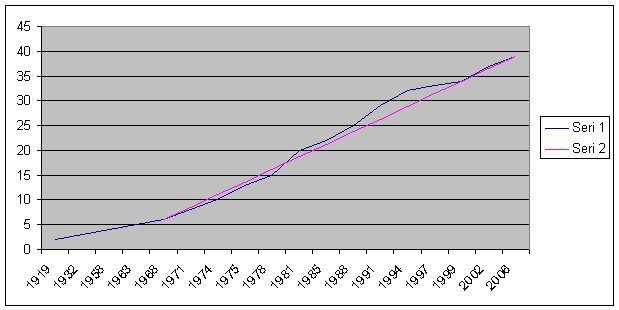
When we look at the Stamp Price Table, we see that stamp price increased aggressively after 1971.
I plotted this data on spreadsheet and it seemed like a linear model can predict future increases.
But there is a problem with this model, and that is the prediction on x-axis values.
Since x-axis doesn't increase linearly, we cannot apply a linear model to this data.
To prevent this problem I created a new data which I filled the blanks in some years without an increase
| 1919 | 2 | 1939 | 3 | 1959 | 4 | 1979 | 15 | 1999 | 34 | ||||
| 1920 | 2 | 1940 | 3 | 1960 | 4 | 1980 | 15 | 2000 | 34 | ||||
| 1921 | 2 | 1941 | 3 | 1961 | 4 | 1981 | 20 | 2001 | 34 | ||||
| 1922 | 2 | 1942 | 3 | 1962 | 4 | 1982 | 20 | 2002 | 37 | ||||
| 1923 | 2 | 1943 | 3 | 1963 | 5 | 1983 | 20 | 2003 | 37 | ||||
| 1924 | 2 | 1944 | 3 | 1964 | 5 | 1984 | 20 | 2004 | 37 | ||||
| 1925 | 2 | 1945 | 3 | 1965 | 5 | 1985 | 22 | 2005 | 37 | ||||
| 1926 | 2 | 1946 | 3 | 1966 | 5 | 1986 | 22 | 2006 | 39 | ||||
| 1927 | 2 | 1947 | 3 | 1967 | 5 | 1987 | 22 | ||||||
| 1928 | 2 | 1948 | 3 | 1968 | 6 | 1988 | 25 | ||||||
| 1929 | 2 | 1949 | 3 | 1969 | 6 | 1989 | 25 | ||||||
| 1930 | 2 | 1950 | 3 | 1970 | 6 | 1990 | 25 | ||||||
| 1931 | 2 | 1951 | 3 | 1971 | 8 | 1991 | 29 | ||||||
| 1932 | 3 | 1952 | 3 | 1972 | 8 | 1992 | 29 | ||||||
| 1933 | 3 | 1953 | 3 | 1973 | 8 | 1993 | 29 | ||||||
| 1934 | 3 | 1954 | 3 | 1974 | 10 | 1994 | 32 | ||||||
| 1935 | 3 | 1955 | 3 | 1975 | 13 | 1995 | 32 | ||||||
| 1936 | 3 | 1956 | 3 | 1976 | 13 | 1996 | 32 | ||||||
| 1937 | 3 | 1957 | 3 | 1977 | 13 | 1997 | 33 | ||||||
| 1938 | 3 | 1958 | 4 | 1978 | 15 | 1998 | 33 |
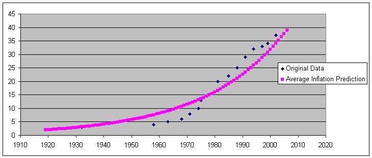
Plotting this data will be more accurate that plotting the original data.
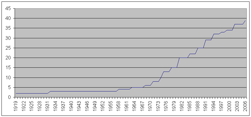
As you seen on the graph above, curve look like an half parabola.
To generate this kind of curve I have two ideas. One if them is Parabola Prediction and other is Average Inflation Prediction.
Parabola Prediction:
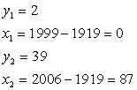
I simply treat the data as points from an parabola in the form of
 . I tried to find a and b values using first
data set and last data set.
. I tried to find a and b values using first
data set and last data set.
so I used {x=YEAR-1919} transformation to use YEAR values more accurately.
Then
Using these values gives us
 .
.
Then we know b=2, using it in the second equation gives us
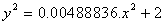
 . Therefore a=0.00488836
.
. Therefore a=0.00488836
.
When we plugged these values , our parabola is
or 
Plotting this function together with original data gives
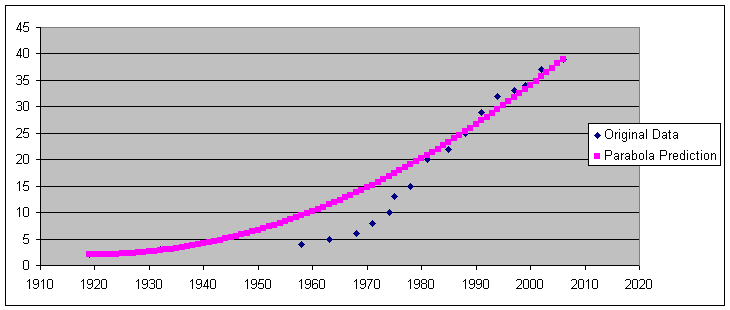
It seems very good model especially for last 20 years
Average Inflation Prediction:
My second idea was a Average Inflation Prediction model.
We know all prices are related to each other and I tried to find a average inflation rate for stamp to predict future prices.
To find average inflation in Excel, I created a column that is like
"Price of next Year" = "Price of this Year" x ( 1+Inflation rate)
Say Inflation rate is a
so it is like
Year1=Year0*(1+a)
Year2=year1*(1+a)=Year0*(1+a)*(1+a)
Year3=Year2*(1+a)=Year0*(1+a)*(1+a)*(1+a)
So it is actually an exponential function , and summary of it looks like
 .
.
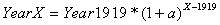
Since we know 1919 as a starting year, we can make it Year0, then 2006 becomes Year87.
If we use plug this transformation to equation above, we get
After I tried several a values for, I found that for a=0.03475 is the nearest values to make Year2006=39 cents. When we plotted this one
Now we can plot all models together
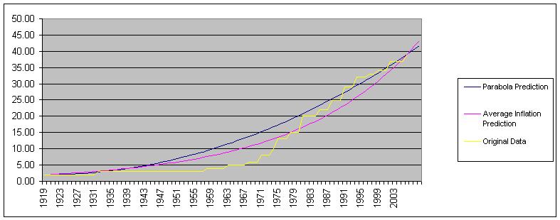
It seems like Average Inflation Prediction is better for overall but Parabola Prediction is more accurate for last 23 years.
So both models have advantages and disadvantages.
When will the cost of a first class postage stamp reach $1.00?
When we extended our model far from 2006, we see that our parabola model predicts 1 dollar in 2061 and average inflation model predicts 1 dollar in 2034.
When will the cost be 74 cents?
Parabola model predicts 74 cents in 2041 and average inflation model predicts 74cents in 2025.
How soon should we expect the next increase?
According to last years, Price increases 3 cents as average so we can predict next price will be 42 cents.
In this case, parabola model say it as a 2010 event, and average inflation model says it is 2009 (may be 43 cents).
In 1996, the analysis of stamp data historically seemed to show that the postage doubled every 10 years approximately. The cost in 2006 would seem to argue that pattern is no longer valid. Is there evidence to show a change in the growth pattern? Or, was the 'doubles every ten years' just a bad model?
For both model, "Doubles every ten years" may occur for specific time periods but it cannot be a generalization.
You can download Excel file of this models from HERE.