An Introduction to
Fathom™
By: Kelli Parker
__________________________________________________________________________________
Many wonderful programs for
statistical analysis have been developed; one of the newest among them is Fathom:
Dynamic Data Software
by Key Curriculum Press. Fathom
will not only perform data analysis tasks such as creating tables, graphs, and
numerical statistics, but it will also run probability simulations, calculate
regression lines, test hypotheses, and help with performing and illustrating
many other statistical processes.
Fathom is not only a great
tool for statistics classes, though!
It has many included data sets and activities that could be used for
other subjects, especially in mathematics. From working with intersections of lines in Algebra 1, to
taking integrals in calculus, Fathom can supplement any classroom with
wonderful illustrations and technological demonstrations of important
concepts.
This website is meant to be
a guide for how to use Fathom for basic tasks and discoveries. The best resource to guide you with
your Fathom use is the Fathom help menu itself, which is found on the menu bar
of the program. The Help menu can
link you to all kinds of assistance, from movie demonstrations of how to work
with Fathom to individual topic- or subject-based instructions. Definitely check out the Help menu for
any complicated work you need to do!
This resource is here for quick learning that will help get you started
exploring in Fathom, and even your students can use this page for their
discoveries! Please check out the
activity links at the bottom of the page.
Use these bookmarks to
find topics quickly!
_________________________________________________________________________________
·
Experience
it Yourself!
A great way to experiment with Fathom for the
first time is to open a Sample Document.
This will allow you to view many of the different functions of Fathom,
as well as see what a finished document can look like.
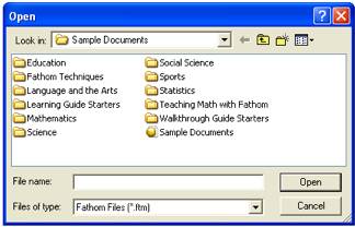
To Open a Sample Document:
1.
Click
“File + Open Sample Document…”
2.
You
will see several folders containing sample documents to work with. Depending on what you want to use
Fathom to demonstrate, you will want to look in different folders. For example, if you want to learn a
little more about what Fathom can do, try “Fathom Techniques”, or the “Sample
Document” worksheet, which actually allows you to search for a particular topic
within all the sample documents that come with the program.
Some of the sample documents contain a collection of data and tell you what to
do with it, leaving an open-ended activity for you and/or your class to work
through. Many of these are found
in the “Education” and “Teaching Mathematics with Fathom” folders.
Other sample documents are already set up to do simulations, with charts and
graphs to record the resulting data entries. Many of these are found in the “Mathematics” folder, with
everything from Algebra 1 simulations of intersecting lines, to probability
simulations of drawing marbles with or without replacement.
·
Using
Sample Data
Fathom comes with multiple sets of sample data, and
most of them are already indicated for a particular use. These sample data sets are found in the
same folders mentioned above.
Some of
the types of data included are:
1.
Census
data (including a way to upload current census data from the U.S. Census website)
2.
Scientific
observations (occurrences of earthquakes, sunspots, and other natural
phenomena, observations of animal behaviors, and chemistry and physics lab
data, e.g. changing water temperatures)
3.
Social
data (population, GDP, unemployment rates, and even smoking data for multiple
continents as well as the whole world)
4.
Sports
data (Olympic times and medal winners, football scores, and many others)
5.
Literary
and art data (collections documenting the numbers of letters and/or words in
famous books, lists of famous artists and painting names)
The best way to discover the wonderful resources
available in the sample documents and data is to simply click “File” and “Open
Sample Documents” and see what you can find!
_________________________________________________________________________________
WORKING
WITH FATHOM: Basic Statistical Analysis
Fathom works on the basis of “Collections.” Any data you bring in to work with gets
placed into a collection. If you
have data in an Excel spreadsheet, here is how to capture it:
1.
Highlight
all the cells you need.
2.
Select
“Edit + Copy” (Ctrl + Copy or Apple + Copy).
3.
Once
in Fathom, click “Collection” on the top menu bar and drag down a new
Collection.
4.
Right
click (Ctrl + Click) the Collection box and select Paste Cases.
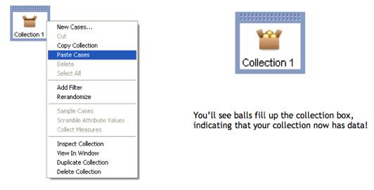
Data you want to use doesn’t have to be in an Excel
spreadsheet; it can be in an online database or another type of worksheet or
format. As long as you can highlight
everything you want and Copy it, you should be able to Paste it into a Fathom
Collection.
Now that your data is in a Collection, it is ready
for you to work with. You can now
create tables or graphs, run tests, obtain summary statistics, and do many
other things. First, we’ll focus
on the basics of analyzing and manipulating a data set.
In order to view your actual data entries, you need
to create a Table.
1.
Click
the icon of the Collection you want to work with.
2.
Click
the “Table” icon on the menu bar and drag down a table. Fathom tables function on categories,
or “Attributes.” The data you
bring in will any number of attributes, listed as the column headings in your
table.
Below is an example of a table and its attributes:

3.
You
can adjust the size of your table by clicking and dragging the bottom right
corner (or any of the other corners).
·
Creating
Dot Plots and Histograms
One of the easiest ways to look at and do a
preliminary analysis of a data set is to get a dot plot or a histogram. Fathom will do this very easily. You can select which attribute(s) you
want to visualize. If you choose
only one, Fathom will default to a Dot Plot or Histogram.
1.
Click
the “Graph” icon on the Menu bar and drag down a Graph box. (The axes will appear but with no
labels.)
2.
Go
to your table and select the attribute you want to observe. Click it and drag it to the graph, and
drop it on the axis of your choice.
(For a histogram, drop the attribute on the x- or horizontal axis.)
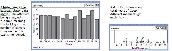
Getting an actual count:
using a summary table with a histogram
Often it is preferred to have a table of counts
instead of a histogram or dot plot.
This is also very easy to do in Fathom.
1.
Click
the “Summary” icon on the Menu bar, and drag down a new Summary Table box.
2.
You
can get a simple count of the number of items in an attribute (for example, the
number of baseball players from each team)
by clicking and dragging that attribute into the summary table.

Using
a scatter plot for bivariate data
You can compare two attributes from a collection
with a scatter plot.
1. Click the “Graph” icon on the menu bar
and drag down a graph box.
2. Select the attribute you want on the
x-axis, and click and drag it onto the horizontal axis of the graph.
3.
Select
the other attribute you want to observe, and click and drag it to the vertical
(left) axis of the
graph.

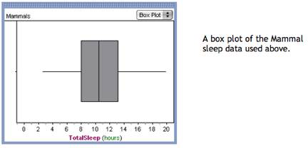
A good way to examine the spread of data is to look
at a box plot of the data set. Fathom
will let you create a box plot in the same way you create a one-variable
histogram or dot plot.
1.
Click
the “Graph” icon on the menu bar.
2.
Drag
a graph box down.
3.
Select
the attribute you want to observe and drag it to the horizontal axis of the graph.
4.
The
graph will default to a dot plot.
Click the box with the arrows in the top right corner and change the
type to a “Box Plot.”
[You will see all the other types of graphs you can create, as well!]
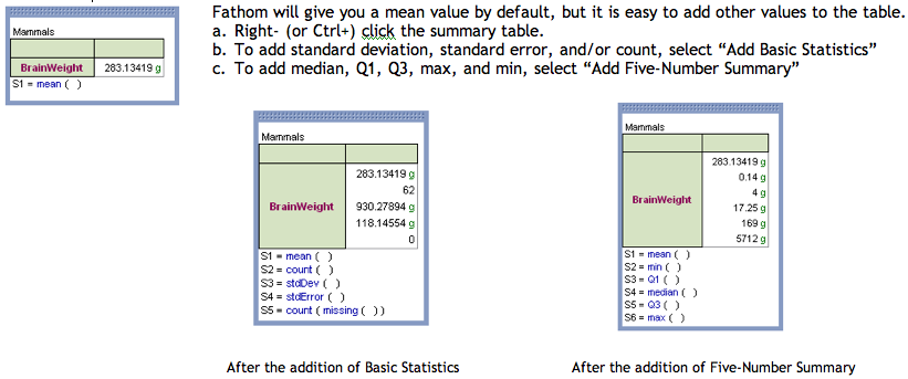
·
Using
Summary Tables to Obtain Summary Statistics
As we talk about the spread of data, we also want
to consider the median and upper and lower quartiles, i.e a five-number
summary, as well as the mean, standard deviation, and other values.
1.
Click
the “Summary” icon on the menu bar and drag down a summary table box.
2.
Click
and drag the attribute you want to examine into the table. You can drop it into the column or row.
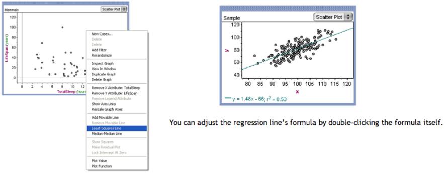
If you already have a scatter
plot of two attributes, Fathom can calculate a least-squares line for you.
1.
With
your scatter plot already displayed, right- (or Ctrl+) click the graph.
2.
Select
“Least Squares Line”. The line
will show up, with its formula below the graph, as well as the r2
value.
_________________________________________________________________________________
WORKING WITH FATHOM:
Activities
This section is intended to
make you aware of some examples of the types of activities Fathom already has
built in. You’ll be surprised what
other subjects Fathom will allow you to work with besides just Statistics! If you are a Mathematics teacher, then
you will want to check out the “Mathematics” Folder when you select “Open
Sample Documents” from the File menu.
(The “Teaching Math with Fathom” mostly contains raw data sets with no
instructions.)
·
Statistics
(in the “Statistics”, not “Mathematics”, folder)
Fathom is great for doing statistics work, from
elementary concept investigations to upper level testing and analysis. The statistics activities available
also range from simple exploration to upper level simulations. Listed below are some of the simpler
activities.
¨
Correlation
Play: a great introductory activity for students first learning about
correlation coefficients.
¨
Quadratic
Regression: exploration of alternate “lines” of best fit.
¨
Binomial
vs. Normal: good comparison of the binomial and normal probability
distributions.
¨
Normal:
a chance to discover a great deal about the normal distribution.
·
Probability
The probability activities are a great opportunity to use simulations to
solidify some difficult concepts.
A few really good ones are:
¨
Balls
Without Replacement: comparing the difference between replacing and not
replacing; emphasizing conditional probability.
¨
Black
Cards: how some events affect
other events.
¨
Fair
Dice: an interesting investigation requiring students to think about important
probability concepts.
¨
Buffon
Needle: a simulation of the famous problem; very interesting!
·
Algebra
1
These activities allow students to see and manipulate algebra concepts that can
sometimes be tricky to understand with non-dynamic graphs and
computations. Students can
manipulate sliders and watch how certain parameters affect equations of lines.
¨
Compound
Interest: a great manipulation of how principal, interest rate, and period
affect total interest.
¨
Rabbit
and Frog: developing equations for the speed of two race participants.
¨
Line
Intersections: a slider manipulation of slopes and intercepts to determine
intersections of two lines.
¨
Slider
Functions: determining what a function is given two sliders depicting its
behavior; similar to Dynagraphs sketch
¨
Screensaver:
a terrific demonstration of parametric equations and how certain values affect
them.
·
Calculus
Using these activities can help illustrate and
solidify basic concepts of calculus, allowing students to explore why those
concepts work.
¨
Derivative
Def: illustrating the formula definition of derivative.
¨
Integral
And Derivative: an exploration of how derivative and integral are related;
Fundamental Theorem of Calculus
¨
Minimization:
exercise in finding critical points of curves using the derivative.
·
Science
Several categories of real-life data students can use mathematical and
statistical principles to analyze.
¨
Biology-Mammals:
this data allows students to perform some really interesting statistical
analysis to find out about animals.
¨
Astronomy-Planet
Scan: exploring an exponential function used to analyze real-world objects!
¨
Chemistry
and Physics-Heating Water: students can use this data to find a function that
describes the cooling pattern of water.
¨
Chemistry
and Physics-Moving Ball: observing the effect of initial position and velocity
on the path of a ball and the parabolic graph that represents that path.
¨
Earth
Sciences-Weather Machine: experimenting with probability of rain or sun on a
given day.
¨
Technology-Airplanes:
great for aviation fans in your classroom; exploring different associations and
graphs.
·
Social
Science
More real-life data students can evaluate, from
numbers of murders in Chicago, including gender and age of victim and
perpetrator, to population and GDP for several other continents and countries.
¨
Canadian
Government Debt: offers not only a fathom activity, but links to other great
lesson ideas.
¨
SAT
GPA: students can analyze associations between gender, gpa, and SAT score.
·
Sports
These data sets and activities are great for
students who don’t care about average heights of buildings and such. From names and statistics of baseball
players to Olympic gold medal winning persons and times.
¨
Baseball
96: lots and lots of baseball statistics; no specific instructions on what to
do, but sport-savvy students should have some great ideas.
¨
Summer
Olympic Medals: students can consider which countries have earned more gold
medals and why.
¨
Bicycling:
allows students to work with a real-life example of slope and linear
regression.
¨
Mile
Records: deals with linear interpolation and extrapolation.
·
DON’T
FORGET YOUR STUDENTS!
Students in your class can generate some great data
sets for you. Have each student
fill in their age, height, shoe size, arm length, number of people in their
family, and lots of other random facts; they can turn out to be great ways to
help your class learn about statistical analysis, using data about them!
Comparing Temperatures of Two Cities
This is a lesson plan and
activity I created with a group for a Math Education class. In this activity, students can explore
whether mean or median is a better measure of center, learn how to create
dot-plots and box-plots, and practice interpreting what graphs and statistical
summaries mean.
Click here for Lesson Plan
Click here for Student Worksheet
Click here for Fathom document
_________________________________________________________________________________________________
Thanks for
visiting! Fathom is a wonderful
resource you and your students will enjoy using.
Happy
Fathoming!!!
Fathom help instructions
activities regression lines box plots tables charts collections scatter plots
mammals data sets teaching math with fathom “fathom lesson plan” sports
activities sports data sets summary tables mean median mode exploring math with
fathom calculus algebra 1