
FATHOM 2 STATISTICAL UNIT
By Leighton McIntyre
Standards: This Unit will cover in part the Georgia Performance standards related to Math1 and Math2
MM1D3. Students will relate samples to a population.
a. Compare summary statistics (mean, median) from one sample data distribution to another sample data distribution
in describing center and variability of the data distributions.
b. Compare the averages of the summary statistics from a large number of samples to the corresponding population parameters.
c. Understand that a random sample is used to improve the chance of selecting a representative sample.
MM2D1. Using sample data, students will make informal inferences about population means and standard deviations.
b. Understand and calculate the means and standard deviations of sets of data.
c. Use means and standard deviations to compare data sets.
.
MM2D2. Students will determine an algebraic model to quantify the association between two quantitative variables.
a. Gather and plot data that can be modeled with linear and quadratic functions.
b. Examine the issues of curve fitting by finding good linear fits to data using simple methods such as “eyeballing.”
c. Understand and apply the processes of linear regression for curve fitting using appropriate technology.
d. Investigate issues that arise when using data to explore the relationship between two variables, including confusion between correlation and causation
Lesson 1: Exploring Data
Lesson 2: Plots
Lesson 3: Summary Statistics
Lesson 4: Graphing Measures of Center: Mean and Median
Lesson 5: Comparing Dta based on Mesaures of Center and Variability
Lesson 6: Scatterplots
Lesson 7: Importing Data
Introduction to Fathom 2
Fathom 2 is a dynamic statistical and data analysis software that can be used to develop the statistical inferences explorations analyze and model data. In the classroom the students can use Fathom 2 to carry out explorations, make questions and answer questions based on data. The students can use Fathom software to investigate statistical such as mean, median, mode, minimum, maximum, range, inter quartile range, standard deviation and skew. Students can gather or create data and make graphs such as dot plots, bar graphs, box plots, scatter plots, line graphs.
Fathom contains sample documents that students can use to explore ideas. The data sets come from a wide range of subject areas, including the social sciences, sports, sciences, arts, and mathematics. The advantage of using pre made data is that some data sets are hard to personally collect such as the make and models of cars through the years 1990 to 2011 classified according to the miles per gallon of each car. Some data sets can be easily made such as the height and weight of the students in your class.
The cool thing about Fathom is that all the data is dynamically linked, for example the data contained in a table is linked to the data contained in a graph asscociated in its graph, so a change in a value in the table will result in an aitomatic change in variable in its graph. THus when you cahange data. Fathom automatically updates all its connected values. Students can ises Fathom to see and changes in results when outliers are added or removed.
Students can use Fathom to calculate summary statisctics and hypotueses tests to hwlp them to interpret data. They can aslo investigeat 'what if' questions more easily.
Working with Fathom
Fathom has several sample documents for us to explore. The sample documents are located in folders with names such as, Mathematics, Education, Social Sciences, Sciences, Fathom Techniques, and Statistics. We will choose to explore the sample document Airplane.ftm located in the Technology folder, which is in the Science folder.
Lesson 1: Exploring Data
Open Fathom
Click File Click Open Sample Document/Science/Technology/Airplane.ftm
Notice that the document is displayed like a box. Click on the Table icon above the box and drag the table icon down into the workspace
The Aircraft Operating Statistics 1999 figures are averages for most commonly used models.
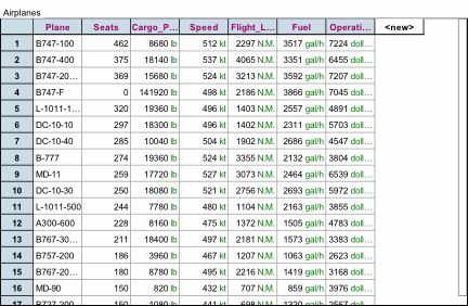
Activity: List some of the most common types of air lines_________________
Which Airline has the most seats?_____________
Which airline has the least seats?____________
Which airline is the fastest? Which Airline is the slowest?__________________
Which airplane is the most fuel efficient?______________________________
Which airplane has the second highest operating costs?________________-_
Does the airplane with the highest speed also have the highest operating cost?___________
Do all airplanes that begin with B have a higher fuel efficiency than all airplanes that begin with the letter L?___
Want is the difference between the airline with the highest speed and the airline with the lowest speed?
Lesson 2: Plots
Click and drag the graph icon to the workspace. Notice that the default graph in fathom is a dot plot. We will work with this kind of plot during this activity.
Click on the Plane column in the table. Drag it to the horizontal axis of the dot plot.
What do you notice? _________________
Click on the Seats column in the table. Drag it to the vertical axis of the dot plot.
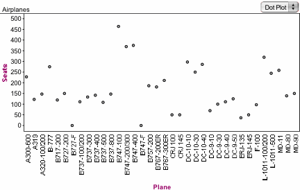
What do you observe? __________________________
Click on Graph in the main menu. Click on remove X attribute. What do you notice about the ordering on the Seats? ___________________________
Repeat the process for the other attributes in the table. Make any additional comments about the graphical displays.
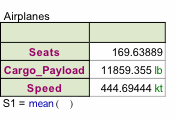
Lesson 3: Summary Statistics
Click on the summary statistics icon and drag it into the workspace.
Notice that it is empty. Drag the Seats label from the Table to the top left column of the summary statistics area. Notice that the display is a number. What does this number represent?
Do the same for the Cargo payload and Speed Labels in the table. How do the numbers compare?
Continue this activity using the other labels.
Now click and drag a new summary statistics icon to the workspace. Click and drag the Seats label form the tale to the top left column of the summary statistics area. Notice again only one number shows up. We want to get other summary statistics for the Seats label. Click on the Summary Statistics tab in the Main menu. In the Drop down menu choose Basic Statistics. What do you observe? ____________________________
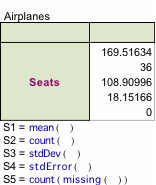
Again go to the Summary statistics tab in the Main Menu. Click Five point summary in the Drop down menu. What do you notice? ___________________________
Repeat this process for the other label in the table. Comment on what happens in the basics statistics area.
Lesson 4: Graphing Measures of Center: Mean and Median
Open the Document Grades Calc2
Click File Open Sample Documents/ Education/ Grades Calc 2
Highlight the Collection and Click the Table icon. Drag the table icon into the workspace. It will display the grades of the students in Calc2 with the attributes, Semester, Sex, Exam 1, Exam 2, Exam 3, Course.
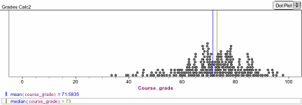
Click graph icon and drag it onto the workspace. Click and drag the Course_ grade label form the table the horizontal axis of the graph.
Click on the Graph tab in the Main Menu. Scroll down to Plot Value. Type mean (Course_ grade) in the pop up box. Click OK
What happens?__________________________________
Click on Graph tab in the Main Menu. Scroll down to Plot Value. Type median (Course_ grade) in the pop up box. Click OK.
What happens?__________________________________
Make a statement about the relative positions of the mean and median. _______________
Repeat this process for the other attributes in the table. That includes Exam1, Exam 2, and Exam 3. Compare the values of the mean and median.
Lesson 5: Comparing Data Based on Measures of Center and variability.
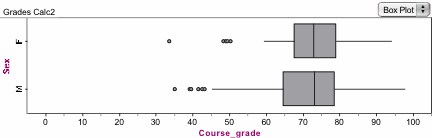
Click the Graph icon and drag it onto the workspace. Click and drag the label course grade from the table to the horizontal axis of the graph. Click and drag the sex label from the table to the vertical axis of the graph. Notice that we have two separate graphs of course grades, one for makes and one for females. This is represented as dot plots. We want to change the graphical representation. Click on the dot plot icon. Scroll down the drop down menu and select box plot. What happens? ___________
What aspects of the data are more pronounced when the display is a box plot rather than dot plot?__________________________
Compare the male and female distributions in terms of the center, how spread out the distribution is from the center, and the outliers.
What effect do you think the outliers have on the data? ________________________
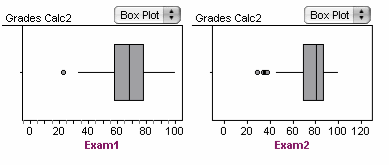
Continue this process for the separating and comparing the distributions of Exam1, Exam 2, and Exam 3 by sex.
Extension: Repeat the process but this time make two box plots each time not separated by sex, of the distributions of Exam1, Exam 2, and Exam 3. Compare the distributions of Exam 1 to Exam 2, Exam 2 to Exam 3, and Exam 1 to Exam 3.
Lesson 6: Scatter plots
Click and drag the graph icon to the workspace. Click on the Exam 1 label in the table and drag it to the horizontal axis. Click on the Course_ grade label in the table and drag it to vertical axis.
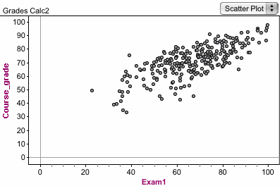
Comment on the association between the Exam 1 and Course_ grade variables _________
Can we say the relationship is causal. Give reasons for your answer?________________________
Explore adding a line that fits the data. Click Graph in the main menu/ Add Movable Line. Use the curved arrow on the graph to move the line to a position that it passes through the center of the dots in such a way that the dots above and below it are about the same.
Explore the least squares line to the graph. Click graph/Least Squares Line.
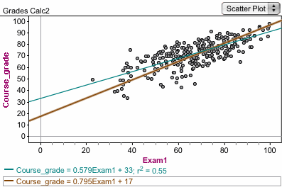
Notice the least squares line (blue line) that is added to the graph. Compare the least squares line to the movable line (brown line) that you estimated. What do the numbers in the equations mean?________________________________
Repeat this process for Using Exam2, then Exam 3 on the horizontal Axis, with Course _ grade on the vertical axis.
Compare the least squares regression lines in the Graphs of Exam1, Exam2 and Exam 3 where Course grade is on the vertical axis?
Which of the exams is the best predictor of Course_ grade; Exam1, Exam2 or Exam3? Give a reason __________________
Lesson 7: Importing Data
You can use Fathom to import data from a spreadsheet file on your computer or form a file on the internet. You can copy and paste data from a file in Excel directly into a table in Fathom.
Use the following link to open an Excel data file cars.xls. After opening the file, copy the table into Fathom and then use the data to answer the following questions.
i). Copy the file Fuel Efficiency to Fathom
Click on the Summary icon. Drag and drop it into the workspace. Drag the attribute Hwy_ FE into the top right column of the Summary box in the workspace. Drag the attribute City_ FE into the top right column of the Summary box in the workspace. Notice that there is only one statistic shown. Click on Summary in the tab. Click add basic statistics.
How does the basis statistics of Hwy_ FE compare to City_ FE?
ii). Drag and drop the Graph icon to the workspace. Drag the Hwy_ FE to the horizontal axis of the graph. Notice that a dot plot pops up.
What do the dots represent __________________________?
iii). Drag and drop another Graph icon to the workspace. Drag the City_ FE to the horizontal axis of the graph. Notice that a dot plot pops up.
How does this dot plot compare to the dot plot for Hwy_ FE __________________________?
iv). Clear the plots and drag two new Graph icons to the workspace. Change the plots by clicking on dot plot and selecting box plot from the drop down menu.
Drag Hwy_ FE and City_ FE to two separate box plot graphs.
How do these box plots compare? ____________________
v). Clear the plots and drag one new Graph icon to the workspace. Change the plot to scatter plot. Drag Hwy_ FE to the vertical axis and City_ FE to the horizontal axis.
Describe the graph and state the association between the two variables? ___________________
vi). Clear the plots and drag two new Graph icons to the workspace. Change the plot to box plot. In the first graph drag Transmission to the vertical axis and Hwy_ FE to the horizontal axis. In the second graph drag Transmission to the vertical axis and City_ FE to the horizontal axis.
What do you observe in each graph? ___________________
vii). Use the analysis you have done to make a statement about choosing a car _________.
To import data from the Internet, first open new document in Fathom. Click File/ Import from URL and type in a web address that contains data.
Use the following URL and open a data file on the Internet: http://www.world-cup-info.com/statistics/world_cup_games_played.htm
Use the data to make a scatter plot in Fathom, which shows the number of games, played to the number of wins. What is the association between the number of games played and the number of wins.
Do the same for the number of games played and the number of losses. What is the association between the number of games played and the number of losses?
You can also open new
document in Fathom and open the web site then Click the web address and drag it
into the Fathom document. Fathom
also has a direct link to US census 2000 data. Click File/ Import Census Data.
Open the Census data file and create a graph of Age (on the horizontal axis) and Sex (on the vertical axis). Comment on the differences and similarities between the distributions in the graph.