
Below are the stamp prices from 1933 to 1936. Using Excel we will plot this data and determine a prediction function, so we can see what the future holds for the price of stamps.


There doesn't seem to be a linear trend happening with this data, but for the sake of exploration, let's try a linear regression.

The correlation for the linear regression is approximately .76, which isn't awful, but judging from the shape of the data, there is probably a better fit! Let's take a look at the trendline using a power equation.
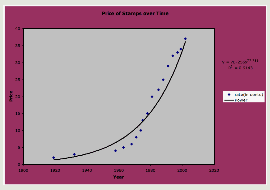
Now we're cooking! The correlation has increased from .76 to .91 indicating that we've found a curve and subsequent equation that will help us predict the stamp prices better than the linear equation above. I should stop while I am ahead, but let's look at one other trendline, the exponential curve.

Not a big difference, but the correlation using the exponential curve is about .92.
One thing that concerns me here though is that there is a huge gap between 1919 and 1932 and then again between 1932 and 1958. Furthermore, the price only increased $.01 over each gap. That's not really exponential growth. Maybe we should consider from 1958 on separately. Let's plot the data again, this time excluding 1919 and 1932.

Looks more linear when you take out those two outliers. Now let's try a linear regression again and see how it fits.
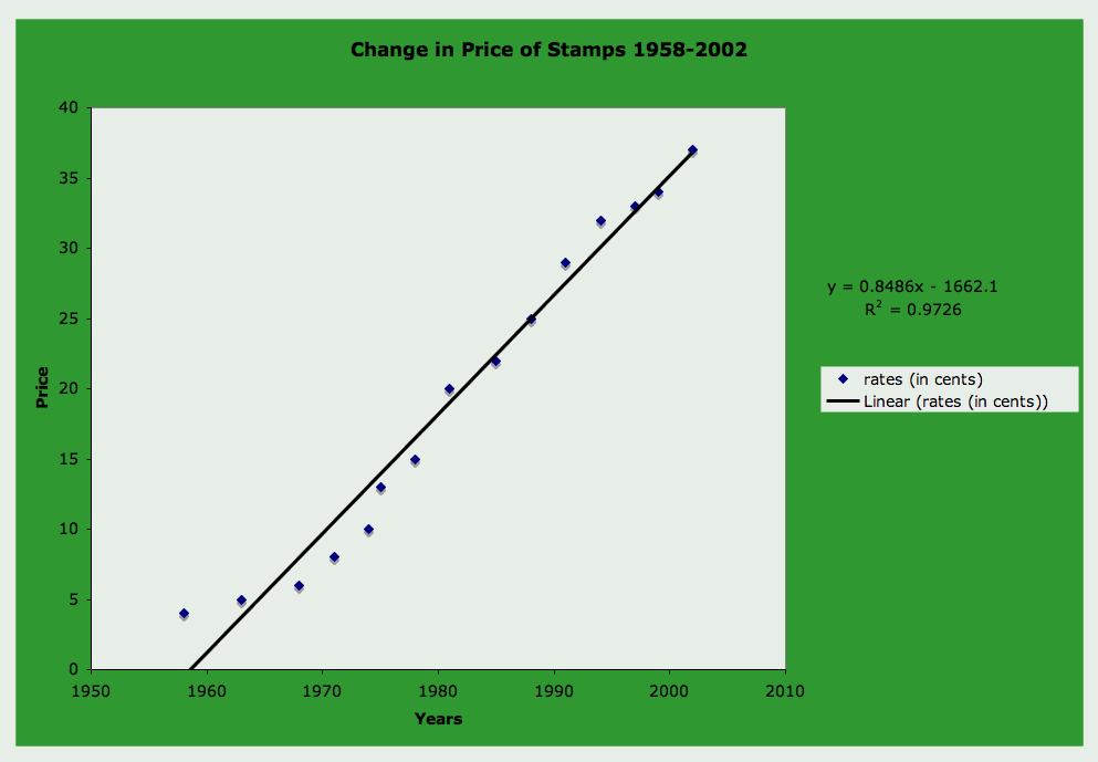
Nice! And look, the correlation value is approximately .97.
According to the linear equation, stamps will cost $1 in the year 2076. They will cost $0.64 in 2034 and the next $0.03 increase to $0.40 according to the data in this graph should have happened in 2006. Compare that to the current cost of $.039 in 2006. Not bad!