
Assignment 12:
Seeing the Forest through the Trees:
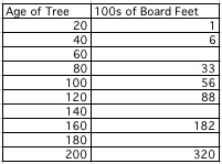
Tree Data for Board Feet
by
Kristina Little
Assignment 12:
Seeing the Forest through the Trees:
Tree Data for Board Feet
by
Kristina Little
The following data is from the lumber industry. The amounts show the approximate number of board feet of usable lumber per tree in a forest for the given age of the tree. The data is very useful for lumber companies and natural resource agencies to keep track and help protect such a renewable resource as lumber.
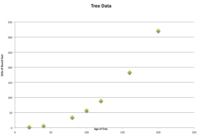
We can now use a spreadsheet program such as Excel to map out the data is a more visible intuitive way.
A helpful way that may researchers find a way to predict values unknown at the time the data samples were taken (such as the gaps we have in our table of values right now) or to predict future numbers based on the trend of what information we do know for certain is to formulate a line of best fit. Below we used the command in Excel to generate a best fit line based on the data we inputted into the program already. This is also possible by hand or TI graphing calculator. We simply use Excel to expedite matters.
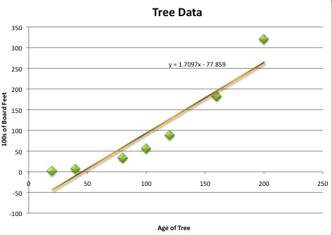 |
It is good to always start with a linear approximation since that is usually the easiest to calculate and may be a fair representation of your data. Here notice how many points are not very close to the line. A linear approximation does not seem to be accurate enough in this case. |
|---|---|
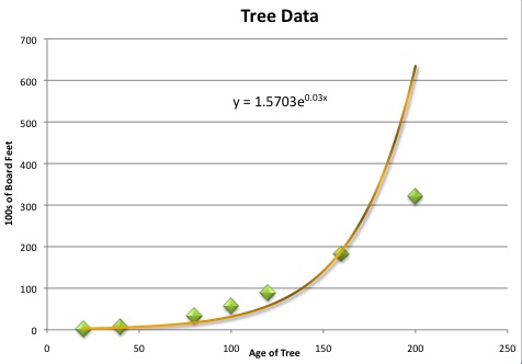 |
So, another idea would be to use exponential (e) approximation. Sometime, when one is estimation items based on age it is understandable to follow an exponential growth trend. On this graph, even though the first few points seem fairly well represented, the later points are falling away from our line. This leads us to believe there may be a better line. |
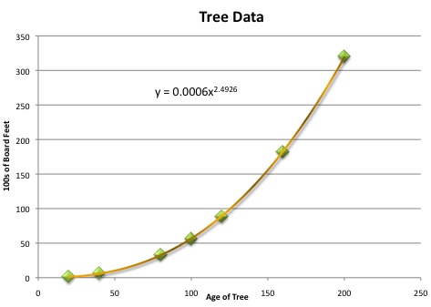 |
Next, one would think that the shape that we are starting to see the points form into looks like a parabola. Maybe our graph is simply a representation of an x-squared graph. We will keep this line in mind for later investigation. |
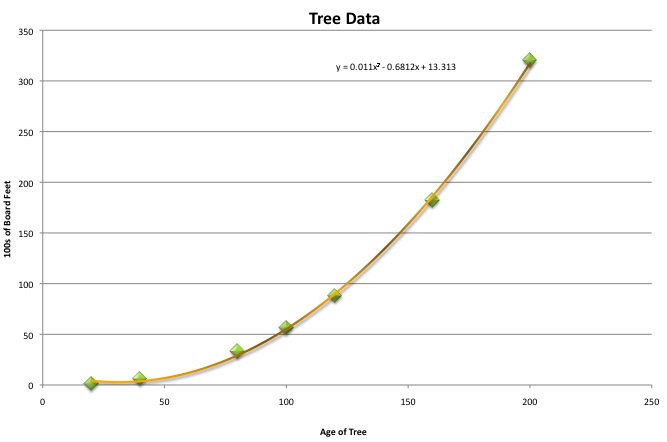 |
Our final line that we will try is a polynomial line of best fit. This line works under the assumption that the graph is simply not a "power of x" but as a full polynomial expression. This line is also very close to all our points. It is difficult to tell simply by looking whether the power graph or this polynomial graph is the true line of best fit. There is a way for us to know this though. |
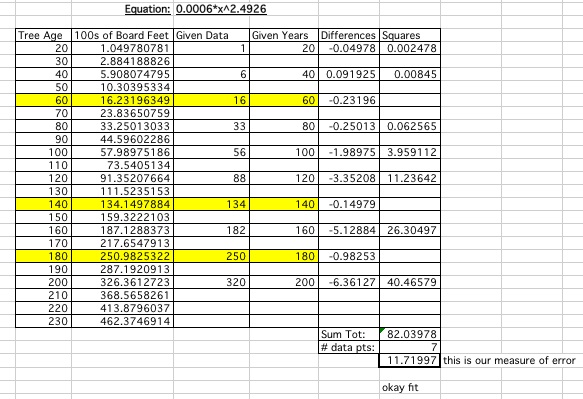
The question does become an issue though of how good is our line of best fit? The easiest way to see a mathematical representation of what we expect is the best line is to compute the measure of error. This measure of error uses the points we are given (known) versus the points we have extrapolated (determined) to find a kind of average of how close the two points are together most of the time.
Line of Best Fit: Power
Line of Best Fit: Polynomial
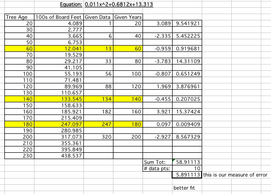
Therefore we can conclude that the polynomial line is the best line of fit for our data.
Once we have decided which function gives us a line that seems to most accurately represent our data, we can use the equation of this line to input the data points where we do not specifically have the information of the number of board feet associated. Then we may be able to use this line to predict what may be useful in a tree of that age. These points are highlighted in yellow on our spreadsheets. We can also make future predictions on the ages of trees we do not have yet using the same line.
Does our graph that we chose and the measurement of error we calculated reflect the same assumption? Calculating this measurement of error we could tell more accurately if the lines of best fit we initially reject were any better for predicting the values we needed.
Do we feel comfortable enough as researchers to submit our findings for ages of tree not measured to a company that will depend on our expertise to determine their business plan for the future?
Final Projects: Bouncing Barney & Another Write-up