
I would like to discuss the graphs of the sinusoidal equation y = a sin (bx + c). This type of graph in my opinion is one of the first types of graphs that high school students learn about which is truly different from the basic linear, quadratic and other polynomial equation graphs that high schoolers discuss. Also, I find these types of cyclic graphs interesting. Not only to these graphs have applications in the real world, fields such as electronics, but they create a high "OOOOO, AHHHH" factor for students who have no experience with secondary school mathematics. Putting a sine graph on the overhead calculator in my 8th grade math classes created a buzz of interest. "How do you do that one? What is that? Why does it keep going up and down like that?", were some of the types of questions generated simply by showing my students one example. We then chose to experiment with different values to see what would change. This desire from a student to learn more is essential to them being able to make the most of their education. For these reasons it is worthwhile to discuss the equations of the form y = a sin (bx + c).
To begin let's look at the graph of y = 1 sin x, the simplest form of the above equation. We would like to be able to show our students that all other forms of the equation can be graphed if we know this base form's graph. The other forms of this equation will simply change the amplitude of the graph, its period, or will create a phase shift. By changing the values of a, b, and c one at a time we can see what affect they each have on the graph.
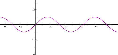
Here it is important that we and our students recognize the cyclic nature of this graph. This can be seen by starting at any point on the graph and tracing along the x-axis. We may begin at x = 0 and trace the graph just beyond x = 6. Here we see one period of this figure. Another period is noticed when we begin just left of -3 on the x-axis and trace just past 3. This cycle always repeats itself if you choose a starting point and trace the graph for a particular distance. Of course, we know this distance to be 2 * pi, but as teachers we would like to engage our students in a discussion so that they may determine the period of this graph for themselves. Also, we see the peaks and valleys of the graph and will change a constant to see how those change. We will also see what changes make the graph slide along the x-axis or move up and down the y-axis. Finally, we will experiment to see if we can make the period of this graph change.
It is important to change only one variable at a time, so that we may view the affect that is created. Let's begin by varying a.
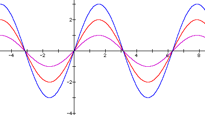
Here we can see that as "a" gets larger the graph reaches higher maximums and lower minimums. Thus, we know that the value "a" controls the amplitude of the graph. Let's see what happens for a < 1.
By viewing this set of graphs we may lead our students in a discussion that will enlighten them to the fact that when 0 < a <1, the amplitude lessens. Also, the students should come to the conclusion that if a < 0, then the graph reflects on the x-axis and maintains the same amplitude as the graph with the -a multiplied by the sine function.
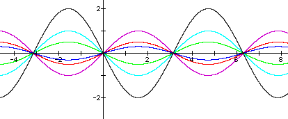
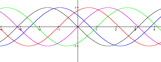
Now we investigate what changing values of b will do to our graph.
Certainly this picture is quite confusing. Here it is important that we help our students to see the differences in these graphs. The main concept to lead discussion towards is the fact that the graph repeats itself faster as b increases. Thus, the period is shortened bases on the choice of b and by a factor of 1/b. When b = 2, the period of the graph is half that of when b = 1. Likewise, b = 4 has a fourth the period of b = 1 and half that of b = 2.
What happens if 0 < b < 1?
From this graph we can see that if 0 < b < 1 that the period will get longer by the factor 1/b.
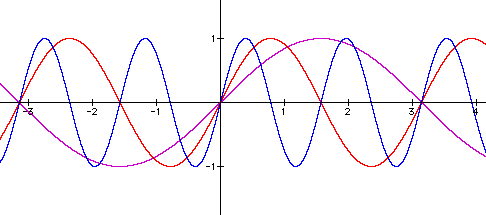
What will happen if b < 0.
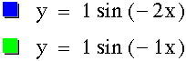
By viewing the purple and green graphs we see instantly that making b < 0 will reflect the graph about the x-axis, while preserving the period and amplitude. This reflection property can also be seen if we compare our red graph here to the red graph in the diagram above (jump to that graph), as well as looking at the blue curve here and the red curve two graphs above (jump to that graph)
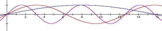
Let's now look at graphs where the value of c varies.
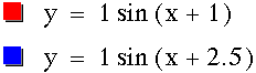
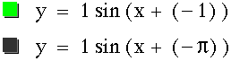
With some careful inspection we can see that changing values of c simply slides the graph left or right along the x-axis. If c is positive then the graph moves the value of c to the left. Likewise if c is negative then the graph slides that distance to the right.
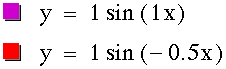
Now that we have seen how the values of a, b, and c affect the graph of the sine function, we should be able to predict how the following sine graphs will appear. Try to determine what each graph will look like and then click the equation to view the graph.
The natural question one would now ask is what will happen to the graph of the sine function if a number is added or subtracted outside the parentheses. Pick your favorite graphing calculator and have fun investigating.