Problem: Examine graphs of:
y = a sin(bx + c)
for different values of a, b and c.
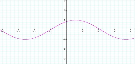
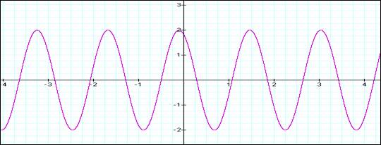
The graph below (graph #1) provides an initial view of the function for the case where:
a = b = c = 1
The interest in this particular function is that by changing a, (or b or c) without changing the b and c (or a,b or a,c) is that the graph provides a very good explanation for the use of this function when discussing waves theory. The parameters a, b and corresponds to amplitude, frequency and phase:
|
Parameter |
Wave Correspondence |
|
a |
amplitude |
|
b |
frequency |
|
c |
phase |
Each of these parameter will be discussed further below – with some graphing examples to indicate the changes that occur, as we change the value of the parameter, while leaving the other 2 parameters constant.
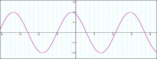
AMPLITUDE:
For the following graph:
b = c = 1
a = 1 Purple
2 Red
3 Green
4 Blue
As can be seen from the graph, as you increase the value of “a”, the maximum value and minimum value for the function increase proportionally. The x an y intercept point remain the same for all case. The slope gets more severe for increasing values of “a”.
The above relations correspond directly to the phenomenon seen with waves. The increases seen on the graph would correspond to increased wave signal – e.g. for audio waves, it would correspond to increased volume (loudness).
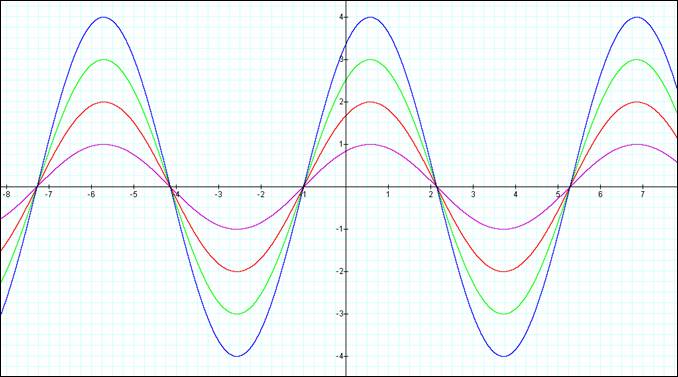
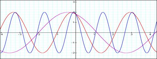
FREQUENCY:
The next graph shows the relationship between the “b” parameter holding the “a” and “c” constant.
For the following graphs:
a= c = 2
i.e. y = 2 sin(bx + 2)
For “b” = 1:
For “b” = 2:
For “b” = 4:
As the value of “b” increase, the number of x axis transitions increases proportionately, for the same x distance.
From “b” =1 to “b” = 2, there are twice as many transitions for the same difference in “x”. When “b” is increased again, from 2 to 4, we again double the transitions.
From the application perspective, this increase of number of transitions for the same difference in x, is referred to as “frequency”. The b parameter in the function corresponds to the frequency. The following graph show the overlay of the 3 graphs shown above.
For the following graph:
a = c = 2
b= 1 Purple
2 Red
4 Green
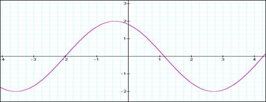
PHASE:
For the following graph:
a = b = 2
c= 0 Purple
1 Red
2 Green
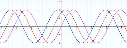
Here the shape of the sine wave remains the same as we change the value of “c”. What does change is the x-value for the point of intersection with the x-axis. (as well as the x value for the maximum and minimum values. The graph appears to “shift” backward on the x-axis.
This shift, as applied to waves, is noted as “phase”. Phase shifts are typically difficult to visualize, however the graph as shown is fairly clear as to what happens when the phase is changed. The impact of using the phase as a key characteristic in radio communication is just beginning to be felt. Most of the increases in digital wireless technology is centered upon use of the phase changes to make additional distinctions in the signal that allows for multiple bits of information to be sent in the same timeframe.