Statistical Analysis
Unit 1
Day 1
Goal: Students should understand the concept of random sample and be able to use Excel to generate lists of random numbers.
Random Samples
What is a random sample? A random sample is a type of sample that is representative of the entire population. One of the properties of a random sample is that each member of the population has en equal chance of being included in the sample. Another necessary condition is that each sample of the same size is equally likely to be selected.
Why
would the following procedures not give a random sample of the
population of
a) Sample every 3rd person entering Lenox Square Mall.
b) Sample every person attending the circus on a Friday night.
c) Sample the parents of all children attending a particular elementary school.
Click HERE to use Excel to generate a list of random samples of the following:
a) A list of possible outcomes from rolling a die 10 times.
b) A list of 15 random numbers from 10 to 25.
c) A list simulating the outcomes of tossing a quarter 25 times. (Assume the quarter is fair.)
d) Suppose there are 30 people at a party. Are there any two people who share the same birthday. Use Excel to simulate the birthdays of the 30 people at the party. (Assume that the year has 365 days. Number the days with 1 representing January 1, 2 representing January 2 and so forth, with 365 representing December 31. Get a random sample of 30 days (with replacement). Were any two birthdays the same? Compare your results with others.
Day 2
Goal: Students should be able to use Excel to present data using various graphs (bar graphs, pictograms, circle graphs/pie charts).
Bar graphs
Click
HERE to use the Excel worksheet listing the number of
millionaires in the
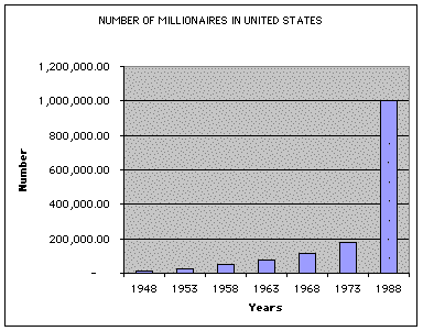
Other graphs
Pictograms - Sometimes pictures are used instead of solid bars. Such a graph is called a pictogram. A pictogram can give an accurate and sometimes more interesting display of data. The following is an example of a pictogram.
Pie Charts - This is another popular pictorial representation of data, and is especially useful for showing the division of a total quantity into its component parts. The total quantity, or 100%, is represented by the entire circle. Each wedge of the pie represents a component part of the total.
Below is a pie
chart showing how a student might budget a $200/month income.
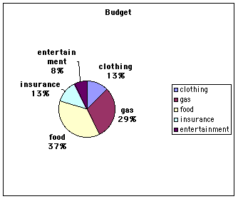
Exercise - Have the students create their own pie chart showing how they might spend a monthly income of $250.00. Click HERE for Excel instructions.
Days 3- 4: Histograms & Frequency Distributions
(It is very possible that the instructor may need to spend more than two days on histograms according the ability level of the students.)
A Histogram differs from a bar graph in two important ways: The bars always touch and the width of the bar represents a quantitative value, such as age. In a bar graph, the bar can be as wide as we want it, but in a histogram the width of the bar has meaning. Let's look at an example.
Suppose you are given the following data related to the distance a random sample of workers in your community drive one way to work.
One way Commuting
Distances in Miles for 44 Workers in Downtown Atlanta
|
13 |
12 |
10 |
3 |
|
16 |
20 |
17 |
10 |
|
4 |
2 |
7 |
25 |
|
8 |
21 |
19 |
15 |
|
3 |
17 |
14 |
6 |
|
12 |
8 |
1 |
8 |
|
4 |
16 |
11 |
18 |
|
23 |
12 |
6 |
2 |
|
14 |
13 |
7 |
13 |
|
15 |
12 |
9 |
18 |
|
13 |
17 |
24 |
9 |
Given this data, how can we condense it to make a histogram? The first thing to do is to decide how many bars or classes you want in the histogram. Five to 15 classes are usually used. You should let the spread of the data and the purpose of the histogram guide you in selecting the number of classes to use.
Next, we need to determine the class width. To do this, we find the difference between the largest and smallest data values and divide by the number of classes. In order to make the class width a whole number, always increase the result to the next whole number so that the classes cover the data. Each class should have the same width. (There are instances when you will see either the first class or the last class with a little longer or shorter width.)
The lowest and highest values in a class are called the lower limit and upper limit. The difference between the lower limit of one class and the lower limit of the next class is called the class width. The center of the class, called the midpoint or class mark, is found by adding the lower and upper class limits and dividing by 2.
For the above
data, let's use five classes.
|
Class |
Frequency |
Class Midpoint |
|
Lower Limit /Upper Limit |
|
|
|
1-5 |
7 |
3 |
|
6-10 |
11 |
8 |
|
11-15 |
13 |
13 |
|
16-20 |
9 |
18 |
|
21-25 |
4 |
23 |
We are almost ready to make the histogram, however, remember we want our bars to touch. Therefore, we need to adjust our class limits so this will happen. We need to make sure our classes are of the same width. In the chart below, if we subtract our lower limit from our upper limit in each class, we will always get 5. Therefore, all our classes are of the same width.
|
Class |
Frequency |
Class Midpoint |
|
Lower Limit /Upper Limit |
|
|
|
0 - 5 |
7 |
2.5 |
|
5 - 10 |
11 |
7.5 |
|
10 - 15 |
13 |
12.5 |
|
15 - 20 |
9 |
17.5 |
|
20 - 25 |
4 |
22.5 |
We are now ready to construct our histogram which is shown below.
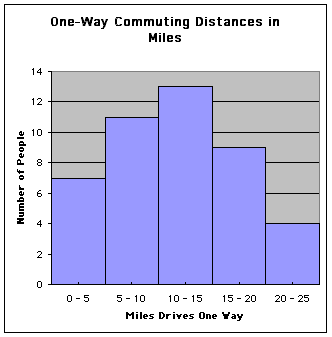
We can see that the width of all the bars is the same. Click HERE to generate a Excel worksheet for students to complete.
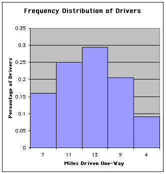
Another useful
way for organizing data involves using relative frequencies. A relative frequency
table gives the frequency of a particular class relative to the total number of
data values. The relative frequency is found by dividing the class frequency by
the total of all frequencies or the sample size.
|
Class |
Frequency (f) |
Relative Frequency (f/n) |
|
Lower Limit /Upper Limit |
|
|
|
0 - 5 |
7 |
.159 |
|
5 - 10 |
11 |
.250 |
|
10 - 15 |
13 |
.295 |
|
15 - 20 |
9 |
.205 |
|
20 - 25 |
4 |
.091 |
|
TOTAL |
44 (n) |
1 |
Your relative frequencies should always add to 1. If the relative frequencies do not add to 1, be sure to check and make sure the error is due to rounding and not in the calculations. The graph below is a frequency histogram.
Day 5
Stem and Leaf Displays
Remember the problem above where we had to organize the raw data of commuting distances? A stem-and-leaf display can be helpful in organizing data to put it in a readable form and also to study it. To make a stem-and-leaf display, we break the digits of each data value into two parts -- the left part is the stem and the right part is the leaf. Shown below is a stem-and-leaf plot of the one-way commuting distances. First, decide how many stems are needed. Our left-side will consist of the numbers zero, one and two since our smallest number is 2 and largest is 25.
|
0 |
3, 4, 2, 7, 8, 3, 6 |
|
1 |
3, 2, 0, 6, 7, 0, 9, 5, 4, 4, |
|
2 |
0, 5, 1, |
Using a stem-and-leaf display can be helpful when putting data into classes for histograms and it can also be useful in studying data and finding measures of variation when you will study in the next section.
Complete the two exercises below.
(a) Make a stem-and-leaf display of the following grades on a science test:
|
64 |
82 |
90 |
73 |
91 |
|
52 |
84 |
88 |
97 |
79 |
|
86 |
65 |
69 |
70 |
89 |
|
75 |
90 |
73 |
80 |
85 |
|
77 |
66 |
85 |
74 |
92 |
(b) Make a stem-and-leaf display of the average daily time spent by 30 eighth graders watching TV over a one month period:
|
2.5 |
2.2 |
3.0 |
1.2 |
1.5 |
3.0 |
|
3.5 |
.5 |
1.8 |
3.4 |
3.2 |
1.9 |
|
3.0 |
2.8 |
4.1 |
3.2 |
1.0 |
0.9 |
|
0.2 |
2.1 |
.7 |
2.0 |
1.8 |
3.5 |
|
2.9 |
1.9 |
2.2 |
2.5 |
.5 |
3.0 |