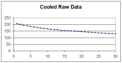
The spreadsheet is a utility tool that can be adapted to many different explorations, presentations, and simulations in mathematics.We will use the spreadsheet to explore and generate a function to predict observed data. We begin by taking a cup of hot water and measure its initial temperature (time = 0) and then record temperature readings each minute for 30 minutes. Make note of the room temperature, 74 degrees. We can then enter the data on a spread sheet and construct a function that will model the data. Click here to see this data in Excel. When we graph the data points we obtain this graph.
We know that the temperature of the water will continue to decrease but the rate of decrease will slow down as the temperature of the water gets closer to the temperature of the room. The temperature of the water will hit a limit since the temperature of the water will never drop below the temperature of the room. We can use the trend line option in excel to produce a function that models this system.
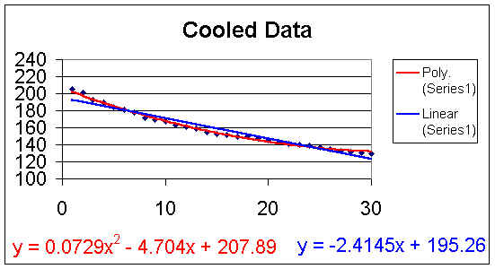
There are several types of trend lines available. First we added the linear trend line and obtained the function y = -2.4145x + 195.26. This linear trend line is represented in the blue. When we try to use this linear function to predict the temperature after 45, 60 and 300 minutes we obtain 86.61, 50.39 and -529.09 degrees respectively. Therefore we can only use this function to interpolate between the data points, Using this function to extrapolate will cause an in error in our prediction that will increase the further we stray from our original data points.
Next we added the polynomial trend line. This function is represented in red and gives us the function y = 0.0729x2 - 4.704x + 207.89. Using this function to predict the temperature after 45 minutes, 60 minutes, or 300 minutes gives us 143.83, 188.09 and 5357.69 degrees respectively. This function accurately represents the data obtained but due to it's shape (a parabola) it will not accurately represent the system when used to extrapolate and predict data. Below is the graph representing these two trend lines discussed, linear and polynomial.
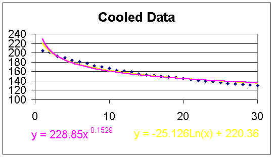
Third we added the logarithmic trend line. This function is represented in yellow and gives us the equation y = -25.126Ln(x) + 220.36. When predicting the temperature at 45, 60 and 300 minutes we obtained 124.71, 117.48 and 77.05 degrees respectively. By comparing their r2 values we can claim that this function did not fit the given data as well as the polynomial function but it was more accurate predicting the temperature when we extrapolated.
The fourth trend line added was the power trend line where the temperature data was raised to a power. This trend line is represented in pink and gives us the function y = 228.85x-0.1529. Again by comparing their r2 values this function did not represent the data points as accurately as any of the previous functions but it did a better job predicting the behavior when extrapolating. Below is the graph with the power and logarithmic functions.
We can compare these four functions' r2 values and their long-range predictions in the chart below.
| r2 | 45 min | 60 min | 300 min | |
| linear | .95 | 86.61 | 50.39 | -529.09 |
| poly. | .9948 | 143.83 | 188.09 | 5357.69 |
| power | .9359 | 127.87 | 122.37 | 95.67 |
| log | .9601 | 124.71 | 117.49 | 77.05 |
By examining this chart, we can state that in order to best predict this system we should use two different functions. For interpolating we should use the polynomial function with the smallest r2 value and when extrapolating we should use the power function with a decreasing rate of change.