So far, we have learned about cirle graphs, bar graphs, line graphs, and pictographs. We have learned how to read them and how to make them from collected. This has all been done with pencil and paper and the use of a calculator to help with calculations. Our graphs while nice, would look professional with the use of technology.
In this assignment, we will use a basic spread sheet program, Excel, to produce circle, line and bar graphs. These graphs will be made from data that I have given you and from data that you have collected on your own. We will then be able to see now much faster and better technology can produce these graphs than we could do them by hand.
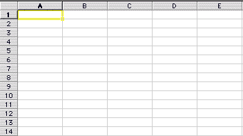
First, we must familiarize ourselves with Excel and how to use it to make graphs. Excel is a table that uses rows and columns to hold data. The rows are named with the use of numbers and the columns are named with the use of letters. Below is a picture of what an Excel spreadsheet looks like.
Notice the yellow box around one of the cells. This cell would be named using the column letter followed by the row number. So, this cell's name is A1. All cells are named this way. The cell to the left would be of the yellow box would be B1; the cell below the yellow box would be A2 and so on. It is essential to understand how the cells are named if one is going to be able to use Excel to make graphs.
When making graphs, we will label our columns and rows based on the data that we have. Then, we will make input the data under these column headings.
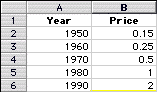
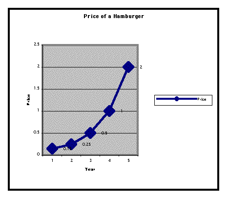
For example, let's look at some data concerning the price of a hamburger. In 1950, the price of a hamburger was $.15. In 1960, the price was $.25. In 1970, the price was $.40. By 1980, the price had risen to $1 and by 1990, the price was $2. Now, let's put this information into a spreadsheet and look at the finished product below.
Now, to make any of these graphs, we will use the chart command. The chart command found by clicking on Insert and then Chart. This will then start a chart wizard that will take a person through the steps involved in making a chart.
The first step is to highlight all of the data in the spreadsheet. Then click on the Insert command and select the chart option. Next, select the type of chart: line, cirlce, bar, etc. This will be done on the following screen.
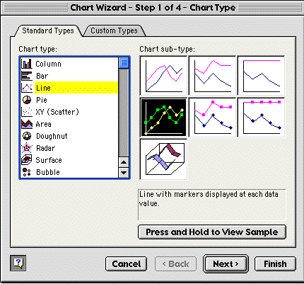
Notice that the word line is in yellow, this shows that I have chosen to make a line graph. After choosing the type of graph, click the next button in the lower right hand corner.
Then, it will ask the data range, which should be entered automatically by having the data highlighted before starting the process. This can be seen in the next picture.
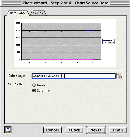
Notice that the data range is already filled in. Then, click on the next button and it will bring up the screen that allows a person to name the graph.
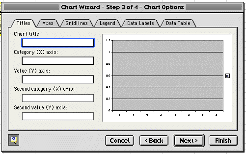
Here, we enter the chart title, the legend, the names of the axes, etc. After we have finished this process, we click on the next button and the final screen in process is shown.
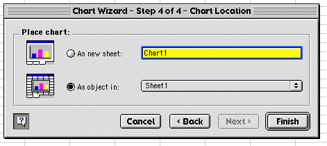
Here, we decide if we want the chart put into a new spreadsheet or inserted into the current spreadsheet. For our purposes, we will select As object in.
We have now created a very nice and professional looking spreadsheet with less time and effort than we needed to make a chart using a paper and pencil. Below is a copy of our finished product.
Click here to open an excel spreadsheet with the example.
Now, It is time for you to make some charts using Excel. Click on the links below to find your assignments.