
An Exploration of Two Conic Sections
By
Ken Montgomery
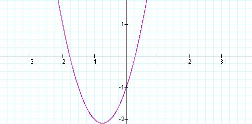
Equation 1: ![]()
This is the graph of ![]() ,
with a = 0.
,
with a = 0.
![]()
So letting a = 1, we obtain an xy term and the graph of Equation 2, in red (Figure 2).
Equation 2: ![]()
This looks, at first to be another
parabola, but with a slightly different major axis.
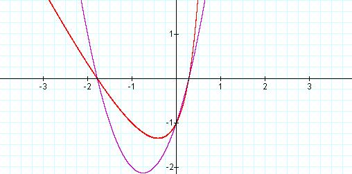
![]() ,
a = 0 (Purple), a = 1 (Red)
,
a = 0 (Purple), a = 1 (Red)
However, redrawing these functions,
with range on the y-axis changed to 25 to 25, we obtain the graphs in Figure
3.
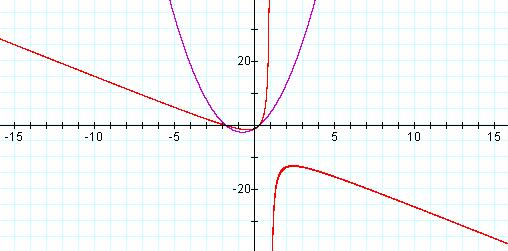
![]() ,
a = 0 (Purple), a = 1 (Red)
,
a = 0 (Purple), a = 1 (Red)
What appeared to be a parabola is actually the top branch of a hyperbola.
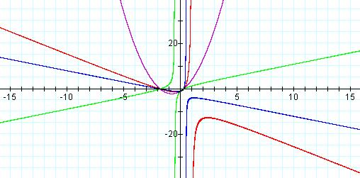
Now, we will systematically change the coefficient of the xy term and observe how this affects the graph. Letting a = 2, we have the graph of Equation 3, in blue (Figure 4).
Equation 3: ![]()
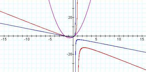
![]() ,
a = 0 (Purple), a = 1 (Red), a =2 (Blue)
,
a = 0 (Purple), a = 1 (Red), a =2 (Blue)
The vertices of the hyperbola have moved closer together and toward the second quadrant, and the general shape has become sharply defined, as the negative slope of the graphs horizontal asymptote appears to have decreased and the slope of the vertical asymptote appears to have increased. However, letting a = -2, we obtain the graph of Equation 4 in green (Figure 5).
Equation 4: ![]()
![]() ,
a = 0 (Purple), a = 1 (Red), a =2 (Blue), a = -2
(green)
,
a = 0 (Purple), a = 1 (Red), a =2 (Blue), a = -2
(green)
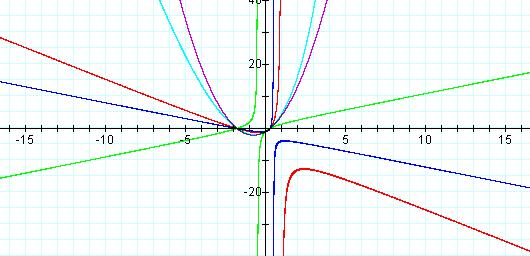
![]() ,
a = 0 (Purple), a = 1 (Red), a =2 (Blue), a = -2
(green), a = -0.2 (light blue)
,
a = 0 (Purple), a = 1 (Red), a =2 (Blue), a = -2
(green), a = -0.2 (light blue)
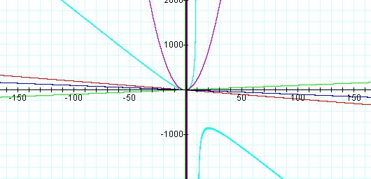
![]() and
the horizontal range to
and
the horizontal range to![]() we
obtain the graph of Equation 5 in light blue (Figure 7).
we
obtain the graph of Equation 5 in light blue (Figure 7).
![]() ,
a = 0 (Purple), a = 1 (Red), a =2 (Blue), a = -2
(green), a = -0.2 (light blue)
,
a = 0 (Purple), a = 1 (Red), a =2 (Blue), a = -2
(green), a = -0.2 (light blue)
Download Assign2KM.gcf to further explore these two examples of conic sections in Graphing Calculator.
Return to Homepage