Assignment#6:
Search the web for data sets that might be represented by each of the following families of functions: linear, periodic, exponential and logarithmic. Create a web page where you briefly discuss and provide links to each of these sources. Then choose one of these data sources to explore further. Create (and provide a link to) an excel worksheet in which you show and discuss the data in at least three different forms (numeric, algebraic and graphic). Explore and discuss ways that you could use this data with your students.
There are a variety of data sets that can be found and later explored with the aid of the internet. The functions that we are interested will require some thinking, however.
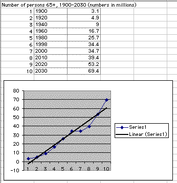
First, let's begin by searching for data that may be considered linear. Population growth would at first seem to be exponential, but when surfing the web I came across a site that discussed the population of persons over the age of 65. Click here to visit this site.
The best way to begin discussing this information is to look at what I have found.
As you can see, the blue line is the graph of the data found, while the black line is that of the linear function meeting this pattern.
One way to be able to discuss these findings with our students would be to give them the data and make them determine the function it meets. Several questions could be asked to move along the discussion:
- What could be the reasoning for the dips in the graph?
- Why does the graph seem to rise above the regression line?
- Is it feasible to assume that this pattern will continue, or will it level off and revert back towards the regression?
All of the previous are excellent questions and could most likely have been caused by birth booms, death surges, increase in health, etc. It is also wise to assume that the pattern will not continue, however level off back towards the regression at some point in time.
The next family of functions that I discovered was the family of exponential functions. To be more specific, I found that the market value of used cars actually adheres to an exponential decay pattern. I visited a site of used car values, Edmunds. To vistit this site and possibly explore for yourself, click here.
Let's view what exactly it was that I found.
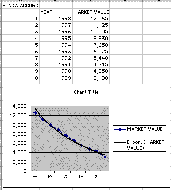
I decided to look at the market value for used Honda Accord 4 Door Sedans, as that has always been a pretty popular car. As you can see from both the table and the graph, the market value drops and follows the exponential decay regression line almost exactly.
But, this makes sense, since the older a car gets, the less likely it is to run smoothly and without problems. However, will the price ever reach $0? The answer is no, however after a certain point a seller will probably not be able to find someone to sell the car to. But, the car could always be sold for parts and scrap, and therefore would still be worth something.
The next set that I decided to search for came through the weather. I decided to look at the average temperature for the city of Athens, Ga.Being as that is where I live, I was interested in seeing a layout of the years weather. This data set turned out to fit a periodic family of functions. To visit the weather site, click here.
Again, let's look at my results, then discuss further.
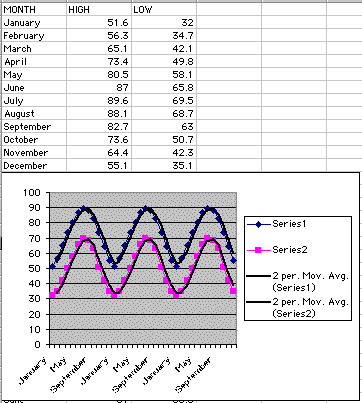
Looking at the graph, it is obviously periodic, as is reinforced by the regression lines. The reason it turns out to be this way is elementary, because the data we have for the monthly temperatures are not for a specific year, but they are the average monthly temperatures for the city of Athens. So, when the function reaches the end of it's period, December, it starts back again at January and will continue the pattern.
What would happen if we had different values for different years, would the graph still result in a periodic regression? Well, the answer is yes because the values we have here are averages, which means that it takes into account the temperatures for different years. What would the difference be then if we did have individual values, surely it wouldn't stay right on track all the time? Well, it would deviate from the regression some, taking into account extreme winters or summers. Overall though, the pattern would stay the same and the result will be pretty close.
Now let's take a look at our last family of functions. I needed to find a data set that resulted in a logarithmic regression line. I thought about looking at the amount of money, gross income, a movie makes over a period of time. If we think about it, the really good ones take off at the beginning, then sort of level until they are finally released from the theaters. I decided to look at a movie that I thought was pretty good because I never actually heard how much money Independence Day made. To view the website that revealed this information to me, click here.
I thought that when discussing this family of functions, we should go a little more in depth. So, I created a spreadsheet that contains this information instead of justing posting a picture of the results.
To link to this sheet, click here.
The first two columns represent the amount of days that the movie was in the theaters, and the Total Gross after that many days. As you can see, and as was expected, the longer this movie stood in theaters the less it started to make, until it eventually was released. The question to ask is why? Well, if we think about it, it makes obvious sense. When a movie first gets released, there has been so much hype over it that everybody runs to see it. After a while though, more and more people have seen it, there aren't many left to pay, so it starts to taper off until it seems to be on it's way to making no more money. That is when it gets removed.
Now, sure it makes logical sense, but how can we see this phenomena take effect. Well, the third column of the spreadsheet represents the ratio of Total Gross values. That is, I took the Gross for a specific day and divided it by the previous value. What do we expect to happen?
Well, since the values follow a logarithmic regression, we would expect them to almost come to a halt. I say almost, because a logarithmic function will never stop growing, however it will appear to stop. So the ratio should be approaching 1. It wouldn't fall below 1, because once it made money, it can't lose it. So a limit of 1 would make the relationship appear to stop, or stay constant. If we look at the third column, we can see that towards the end of Independence Day's stay at the theaters, the ratio of Total Gross gets closer and closer to one.
So, let's look at the graph of this function so that we can visualize what it actually looks like. The blue line is the graph of Total Gross compared to days in the theater, while the black line is the regression line that this relationship follows. As you can see, the blue line follows the regression line pretty closely. Why is it though that at one point the blue hovers over the regression line, but towards the end it dips below?
Well, like we have noticed in some of the previous examples, this is a real world example, and therefore takes into effect the trends of the population. The reason for the drop below the regression line is related to a previous observation that being only a movie, once the majority of people have seen it a couple of times, there is no demand to watch it anymore. But, the general pattern does hold, and therefore the data for Total Gross is a pretty good example of how a logarithmic function can operate in the real world.
The last topic that requires discussing is how can we interest our students with information of this type?
Well, the processes involved in this assignment included surfing the web, which is proving to be an excellent research tool that students of all ages can find valuable. After finding the data, as a teacher I could make my students present what they found in spreadsheets the way that I have here. Plot your data, visually interpret your results(graph), relate the results to mathematical functions. Then after that, discuss why these real world situations follow the regressions of these functions.
Of course, as teachers of mathematics, we must be creative to keep our students interest. I think that relating math functions such as the ones I have discussed here is a good way to answer their most asked question--When will I need math in the real world?