When you visit the doctor, many times the doctor or nurse will take a blood sample. The population in this case is all of your blood. Be thankful for samples!
Let's look at the quality rating for
natural peanut butter:
71.00 69.00 60.00 60.00 57.00 52.00 34.00 89.00 69.00 69.00 67.00 63.00 57.00 40.00
For the regular peanut butter:
76.00 60.00 54.00 43.00 40.00 35.00 34.00 33.00 31.00 23.00 23.00 11.00 83.00 83.00 54.00 49.00 46.00 45.00 40.00 34.00 31.00 29.00 26.00
First we will create a five number summary of the data and then create a box-n-whisker graph using these values.
First we will look at the data for the natural brands:
Step 1: Arrange the data from smallest to largest and label them from 1 to the number of data points:
| 34.00 | 40.00 | 52.00 | 57.00 | 57.00 | 60.00 | 60.00 | 63.00 | 67.00 | 69.00 | 69.00 | 69.00 | 71.00 | 89.00 | data |
| 1 | 2 | 3 | 4 | 5 | 6 | 7 | 8 | 9 | 10 | 11 | 12 | 13 | 14 | rank |
tip: If you have the data in a spreadsheet you can highlight the column holding the data and sort it in ascending order.
Step 2: Find the median of the data:
We have 14 data values so to compute the median of an even number of data values we compute the mean of the two middle values: 7 and 8 (14/2 = 7, 14/2 + 1 = 8) . So with the data above we get : (60.00+63.00)/2 = 61.5
Step 3: Find the lower quartile:
Now we just consider the data values less than the median of 61.5:
| 34.00 | 40.00 | 52.00 | 57.00 | 57.00 | 60.00 | 60.00 | data |
| 1 | 2 | 3 | 4 | 5 | 6 | 7 | rank |
The lower quartile is the median of the numbers above. Since we have an odd number of data points the median is the data value with rank (7+1)/2 = 4. So the lower quartile is 57.00.
Step 4: Find the upper quartile:
Now just look at the data values above the median (I ranked them from 1 to 7 to compute the median of this group):
| 63.00 | 67.00 | 69.00 | 69.00 | 69.00 | 71.00 | 89.00 | data |
| 1 | 2 | 3 | 4 | 5 | 6 | 7 | rank |
The upper quartile is the median of the numbers above. Since we have an odd number of data points the median is the data value with rank (7+1)/2 = 4. So the upper quartile is 69.00.
Step 4: Find the minimum and maximum value:
| 34.00 | 40.00 | 52.00 | 57.00 | 57.00 | 60.00 | 60.00 | 63.00 | 67.00 | 69.00 | 69.00 | 69.00 | 71.00 | 89.00 | data |
| 1 | 2 | 3 | 4 | 5 | 6 | 7 | 8 | 9 | 10 | 11 | 12 | 13 | 14 | rank |
with the data ordered it is easy to see the minimum value is 34.00 and the maximum value 89.00.
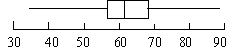
Step 5: Create the Box-n-Whisker Plot:
We are now ready to create our Box-n-Whisker plot:
The rectangle is drawn from the lower quartile (57.00) to the upper quartile (69.00) the vertical line in the middle is the median (61.5). The whiskers extend to the minimum value (34.00) and the maximum value (89.00).
Step 6 : Title Your Plot
We can compare the quality ratings of the regular brands to the quality ratings of the natural brands by computing a box-n-whisker graph for the quality ratings of the regular brands on top of the box-n-whisker graph of the quality ratings for the regular brands:
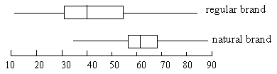
It is very easy to see the differences in the medians and range of quality ratings for the natural and regular brands of peanut butter. If we had a third group such as organic brands, we could compare them by computing the box-n-whisker graph on top of our two existing graphs.
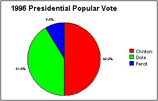
Step 1: Draw a circle
Step 2: Use a protractor to draw the angle for each sector
In our example, the data for the 1996 Presidential election (popular vote) is:
so to find the angle for each sector we divide the number of votes by the total votes to find the fraction of the whole, then multiply by
to find the number of degrees for the sector. So the sector for Clinton would have an angle of:
, The sector for Dole would be:
and Perot's sector:
. Notice that 180+149+31=360.
Step 4: Use a protractor to draw the sectors.
Step 5: Label the sectors and give your chart a title.
Most spreadsheet programs will make a circle graph. Just choose pie as the type of graph.
Let's look at the quality rating for
natural peanut butter:
71.00 69.00 60.00 60.00 57.00 52.00 34.00 89.00 69.00 69.00 67.00 63.00 57.00 40.00
Step 1: Arrange the data from smallest to largest:
| 34.00 | 40.00 | 52.00 | 57.00 | 57.00 | 60.00 | 60.00 | 63.00 | 67.00 | 69.00 | 69.00 | 69.00 | 71.00 | 89.00 |
tip: If you have the data in a spreadsheet you can highlight the column holding the data and sort it in ascending order.
Step 2: Make a number line that is equally spaced and contains all the data:
Step 3: Place dots above the numbers indicating the data for the variable.
The first data point is 34.00 so a dot is placed above the number line at 34.00. Continue until all the data for the group you are interested have been recorded.
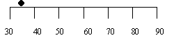
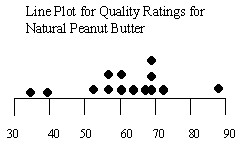
Step 4: Give your Line plot a title
We can compare two or more groups by placing two or more plots on one number line:
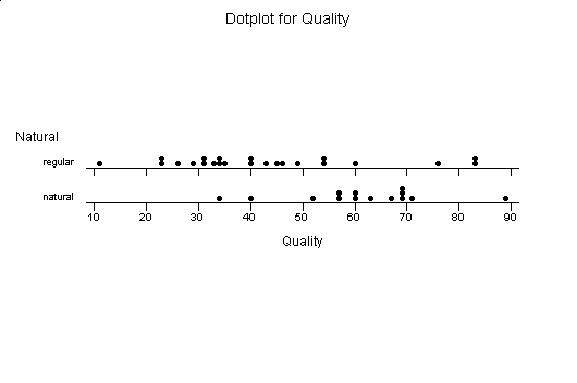
Let's look at the quality rating for
natural peanut butter:
71.00 69.00 60.00 60.00 57.00 52.00 34.00 89.00 69.00 69.00 67.00 63.00 57.00 40.00
For the regular peanut butter:
76.00 60.00 54.00 43.00 40.00 35.00 34.00 33.00 31.00 23.00 23.00 11.00 83.00 83.00 54.00 49.00 46.00 45.00 40.00 34.00 31.00 29.00 26.00
It is hard to compare the quality ratings with the data in this form, so let's see what they look like in stem-n-leaf-plot form.
First we will look at the data for the natural brands:
Step 1: Arrange the data from smallest to largest:
| 34.00 | 40.00 | 52.00 | 57.00 | 57.00 | 60.00 | 60.00 | 63.00 | 67.00 | 69.00 | 69.00 | 69.00 | 71.00 | 89.00 |
tip: If you have the data in a spreadsheet you can highlight the column holding the data and sort it in ascending order.
Step 2: Decide what the stem should be:
since the smallest data value is 34 and the largest 89 the stem should be the tens digit of the number. The stems go from 3 to 8:
- 3
- 4
- 5
- 6
- 7
- 8
Step 3: Put the leaves next to the stem they belong to:
there is one number with a 3 in the tens digit, it is 34 so the leaf 4 goes next to the stem 3 together they give us our data value of 34. The stem 4 has a leaf of 0, the stem 5 has one leaf of 2 and two leafs of 7, continuing we have our stem-n-leaf plot.
3 4 4 0 5 2 7 7 6 0 0 3 7 9 9 9 7 1 8 9
Step 4: Add a key to indicate the value of the stem:
Key means 34.
3 4
Step 5: Give your Stem-n-Leaf Plot a title
Our data is now arranged in a way that we can see its shape, easily see its range and what is the most common tens digit.
The stem and leaf for the quality ratings of the regular brands are:
| 1 | 1 |
| 2 | 3 3 6 9 |
| 3 | 1 1 3 4 4 5 |
| 4 | 0 0 3 5 6 9 |
| 5 | 4 4 |
| 6 | 0 |
| 7 | 6 |
| 8 | 3 3 |
We can compare the two stem-n-leaf plots in a side by side form of the stem-n-leaf plot.
| Natural | Regular | |
| 1 | 1 | |
| 2 | 3 3 6 9 | |
|
3 4 |
3 | 1 1 3 4 4 5 |
|
0 |
4 | 0 0 3 5 6 9 |
|
2 2 7 |
5 | 4 4 |
|
0 0 3 7 9 9 9 |
6 | 0 |
|
1 |
7 | 6 |
|
9 |
8 | 3 3 |
| 1 | 1 |
This makes it much easier to compare one variable that is in two different groups. What if we had a third group?
| 34.00 | 40.00 | 52.00 | 57.00 | 57.00 | 60.00 | 60.00 | 63.00 | 67.00 | 69.00 | 69.00 | 69.00 | 71.00 | 89.00 | data |
| 1 | 2 | 3 | 4 | 5 | 6 | 7 | 8 | 9 | 10 | 11 | 12 | 13 | 14 | rank |
| Range Quality Ratings | Number in Range |
| 30-40 | 1 |
| 40-50 | 1 |
| 50-60 | 3 |
| 60-70 | 7 |
| 70-80 | 1 |
| 80-90 | 1 |
Now we can make our histogram using the ranges and the counts of data values in those ranges. The ranges will give us the base of each rectangle we need to make and the number will be the height of our rectangles:
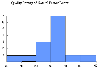
Notice the similarity to the stem-n-leaf plot we obtained with this data:
Quality Ratings of Natural Peanut Butter
| 3 | 4 |
| 4 | 0 |
| 5 | 2 7 7 |
| 6 | 0 0 3 7 9 9 9 |
| 7 | 1 |
| 8 | 9 |
If we rotated the stem-n-leaf plot so the leaves went up instead of the the right it would give us the histogram.
Step 1: Draw the axes. It should include the range of your data.
Step 2: Mark the intervals on the axes.
For the graph below, the horizontal axis will give us the percent of the population, while the vertical axis gives us the type of exercise.
Step 3: Draw a bar for each category based on the data.
Step 4: Give your graph a descriptive title.
For the graph below the categories are the type of exercise. Two Bars will be drawn for each category, one for females and one for males. The bars represent the percentage of males or females that participated in the form of exercise indicated by the category. For example 22.5% of males participated in exercise walking and 37.8% of females participated in exercise walking. The bars show this:
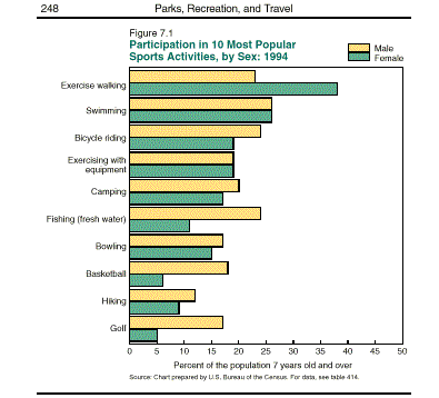
Most spreadsheet programs will create a bar chart from your data.
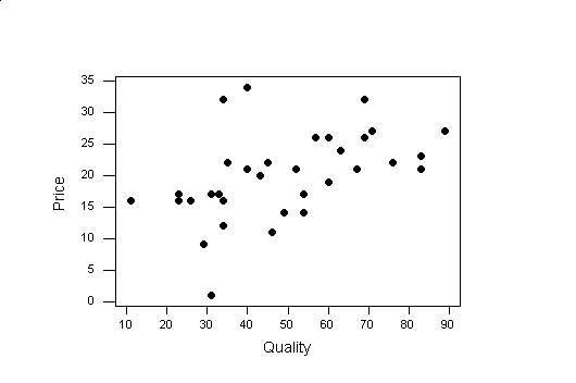
A scatter plot is a way to look at two variables. For example if we wanted to see if the price of the peanut butter was a predictor of the quality we could make a scatter plot of price and quality. Most spreadsheets will perform scatter plots. To create a scatter plot, you look at the pairs of data given by the two variables of interest as a coordinate pair. For example, consider the quality rating and price in the peanut butter data.For each observation (row) we have a number for the quality and price.
Step 1: Decide which variable we want on the horizontal axis and make an axis that will include the range of data.
In the peanut butter data we want to see if quality predicts price, so quality will go on the horizontal axis.
The range of quality ratings is from 11 to 89, so we can create a horizontal axis from 10 to 90.
Step 2: Then we need to create a vertical axis which includes the range of the other variable.
The range of price is 9 to 32 so we will make our vertical axis from 0 to 35.
Step 3: Plot the values of the two variables as points.
Now we are ready to plot our points. For our first observation the Smucker's Natural Peanut Butter has a quality rating of 71 and a price of 27, so we find 71 on the horizontal axis and 27 on the vertical. If we drew a vertical line at 71 on the horizontal axis and a horizontal line at 27 at the vertical axis, the intersection of the two is where we plot the point (71,27). We continue plotting the pairs for all the observations in our data set.
| Name |
|
Price |
| Smucker's Natural | 71 | 27 |
| Deaf Smith Arrowhead Mills | 69 | 32 |
| Adams 100% Natural | 60 | 26 |
| Adams | 60 | 26 |
| Laura Scudder's All Natural | 57 | 26 |
| Country Pure Brand (Safeway) | 52 | 21 |
| Hollywood Natural | 34 | 32 |
| Smucker's Natural | 89 | 27 |
| Adams 100% Natural | 69 | 26 |
| Deaf Smith Arrowhead Mills | 69 | 32 |
| Country Pure Brand (Safeway) | 67 | 21 |
| Laura Scudder's All Natural | 63 | 24 |
| Smucker's Natural | 57 | 26 |
| Health Valley 100% Natural | 40 | 34 |
| Jif | 76 | 22 |
| Skippy | 60 | 19 |
| Kroger | 54 | 14 |
| Nu Made (Safeway) | 43 | 20 |
| Peter Pan | 40 | 21 |
| Peter Pan | 35 | 22 |
| A&P | 34 | 12 |
| Food Club | 33 | 17 |
| Pathmark | 31 | 9 |
| Lady Lee (Lucky Stores) | 23 | 16 |
| Albertsons | 23 | 17 |
| Shur Fine (Shurfine Central) | 11 | 16 |
| Jif | 83 | 23 |
| Skippy | 83 | 21 |
| Food Club | 54 | 17 |
| Kroger | 49 | 14 |
| A&P | 46 | 11 |
| Peter Pan | 45 | 22 |
| NuMade (Safeway) | 40 | 21 |
| Lady Lee (Lucky Stores) | 34 | 16 |
| Albertsons | 31 | 17 |
| Pathmark | 29 | 9 |
| Shur Fine (Shurfine Central) | 26 | 16 |
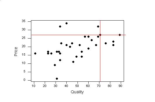
The intersection of the red line is where we plot the first observation (71,27).
Step 4: Give your Scatter Plot a title
Spreadsheet programs will create a scatter plot of your data. Make sure you enter the two variables of interest beside each other. Highlight the two columns and choose scatter plot as the type of graph.