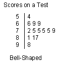
The bell-shape curve is the most common.
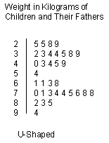
The U-shaped curve is often two bell-shaped curves next to each other. This might mean the data you have plotted can be split into two groups. What two groups might you split the weight of children and their fathers into?
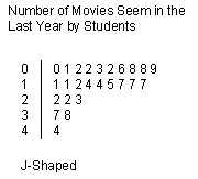
The J-shaped plot is not as common. As you see in the example above, the plot looks like a portion of the bell-shaped curve and occurs because the data values cannot go above or below a certain value, in our case the numbers of movies a person watched must be greater than zero.
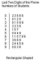
The rectangular, or uniform, occurs becaues there are upper and lower limits on the possible values for the data and the data values are equally spread through that range.