
Polar equations can represent many different types of graphs. Possibly one of the most well known is the n-leaf rose. An example of a five leaf rose is shown below.
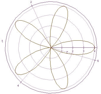
The equation that goes along with this graph is![]()
The standard form for an n-leaf rose is![]()
Although the n-leaf rose is a very interesting equation to explore, the
equations that will be explored here are of the form![]() , where p
is any real number. Also in this discussion, the 'cos(t)' in the previous
equation will be replaced with 'sin(t)' to allow for the comparison between
the two equations.
, where p
is any real number. Also in this discussion, the 'cos(t)' in the previous
equation will be replaced with 'sin(t)' to allow for the comparison between
the two equations.
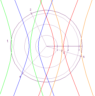
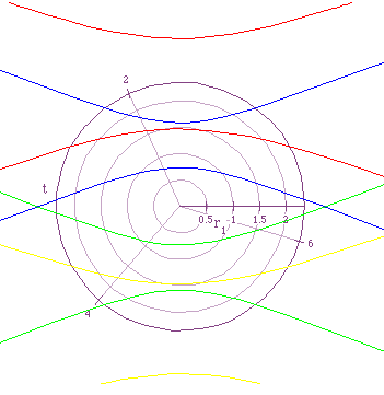
Notice in this figure that the graphs when p=-2 and when p=2 are similar in that they are of the same shape and the same distance from the origin (one to the right of the origin and one to the left). This relationship is also true between the graphs of p=-1 and p=1. As p becomes smaller the two parts of each graph come closer and closer together and move closer and closer towards the origin. On the contrary, as p becomes larger the two parts of the graphs start to spread apart and move away from the origin. This can be understood by examining the equation. The denominator in the equation is always staying the same along with the e in the numerator, therefore, the only variable that changes the graphs is p. So as the absolute value of p becomes smaller the value of r becomes smaller and thus the graph moves towards the origin, and as the absolute value of p becomes larger the value of r also becomes larger and the graphs widen and move away from the origin.
What would you expect to happen to the graphs if
in the equation that was explored the '-cos(t)' was replaced by '+cos(t)'?
Would you expect it look similar to Figure 1? Different? Why? Figure
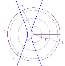
2 portrays the graphs for the equation![]() , for p=-2,-1,1,2.
, for p=-2,-1,1,2.
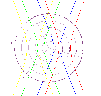
Notice that these graphs are similar to those in Figure 1. As the absolute value of p becomes larger the graphs move away from the oeigin and as the absolute value of p becomes smaller the graphs move towards the origin. Also, notice that the graphs for negative values of p are now located to the left of the origin and the graphs for positive values of p are located to the right of the origin. This is opposite of the way they were in Figure 1.
The next two equations that will be explored are similar to those that have already been explored other than the 'cos(t)' will be replaced by 'sin(t)'. Using what you already know about 'sin' and 'cos' functions what would you expect the graphs to look like when the equation includes 'sin(t)' in the denominator instead of 'cos(t)'?
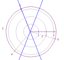
The first of these equations is ![]() . As before the value of
p will be p=-2,-1,1,2. Figure
3 illustrates this equation for the four values of p just mentioned.
. As before the value of
p will be p=-2,-1,1,2. Figure
3 illustrates this equation for the four values of p just mentioned.
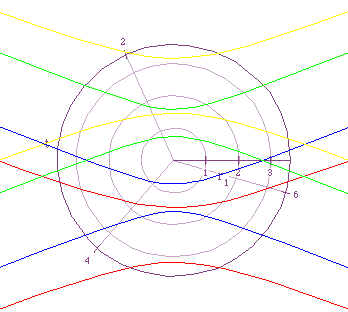
The characteristics outlined for Figure 1 hold true here also.
The only real difference is that the graphs in Figure 3 are a 90
degrees to the left rotation of the graphs in Figure 1. With Figure
3 in mind and the results displayed in Figure's 1 and 2,
how would expect the graphs to look when '-sin(t)' is replaced by '+sin(t)'?
One really good hypothesis would be that the graphs would look very similar
other than the graphs when p is positive would be the upper-most
graphs and the graphs when p is negative would be the lower-most.
If your hypothesis resembled what was just described, you are right on the
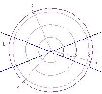
money. Figure 4 allows you to see this for yourself, what the graphs
of ![]() , for p=-2,-1,1,2 look like.
, for p=-2,-1,1,2 look like.
This figure may not look like Figure 3 flipped over, but if you look at the two figures you will notice that they both use different ranges for r.
Now that we have explored four equations for p=-2,-1,1-2, what
would you expect the graphs to look like when 0<p<1. As mentioned
above, the smaller p becomes the closer to the origin the graphs
move and the closer together the two pieces of each graph become. Figure
5 illustrates the equation![]() , p=.5 and p=.1.
, p=.5 and p=.1.
As you can see in Figure 5, the smaller the value of p,
the closer to the origin the graphs get. This point is only illustrated
for the equation![]() because the graphs of the other three equations
can be determined with some simple shifting and/or rotating of Figure
5.
because the graphs of the other three equations
can be determined with some simple shifting and/or rotating of Figure
5.
To take even a closer look at the hypothesis that as p becomes
smaller the graphs move closer and closer to the origin, we will let p=1
and raise e to a negative power and see what the graphs look like.
The equation that was explored for these different values of e was![]() . Where p=1 and e in the numerator was the values displayed
in the first row of the table below. The e in the denominator remained
exactly that for this part of the investigation.
. Where p=1 and e in the numerator was the values displayed
in the first row of the table below. The e in the denominator remained
exactly that for this part of the investigation.
| |
|
|
 |
 |
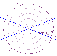 |
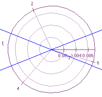
Notice that no matter what power of e was used there was still
an X shaped graph as a result. However, you need to look at the ranges for
r when looking at these graphs also. If the graph for![]() would have been
graph on the same graph as
would have been
graph on the same graph as![]() it would have looked like a point at
the origin if you could see it at all. The range of r for
it would have looked like a point at
the origin if you could see it at all. The range of r for![]() is
from 0->~3, while the range of r for
is
from 0->~3, while the range of r for![]() is 0->3.1x10^-42.
By changing the range the two graphs look similar, but if one was to view
them both on the same graph you would only see one or the other because
their ranges are so far apart.
is 0->3.1x10^-42.
By changing the range the two graphs look similar, but if one was to view
them both on the same graph you would only see one or the other because
their ranges are so far apart.
A couple more interesting outcomes of the equations discussed herein
occur when the equations are written in the forms and
and . Looking first
at, the graph resembles a circle as can be seen in Figure 6.
. Looking first
at, the graph resembles a circle as can be seen in Figure 6.
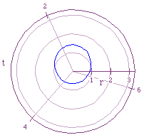
As the exponent of the e in the numerator becomes more negative the circle-like graph becomes smaller and smaller. This can be understood from the equation because the numerator would be getting closer and closer to zero thus making r look more and more like a point. Also, as the exponent of the e in the denominator becomes more negative, the graph becomes more and more centered around the origin.
Now looking at, we get something that resembles an egg or ellipse.
Figure 7 illustrates this equation.
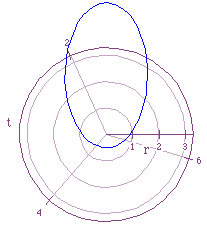
Once again as the exponent of the e in the numerator becomes more negative the egg or ellipse-like graph becomes smaller and smaller and as the exponent of the e in the denominator becomes more negative, the (what seems to be a) foci of the graph becomes more and more centered around the origin. The last two figures were only shown for one of the four equations that were discussed in this exploration, however, by looking back to the start of the discussion when all four equations were talked about you should be able figure out what the graphs of the other equations would look like because they are all just a rotation or flip horizontally or vertically different from one another.