
Parametric Curves
By Donna Greenwood
A parametric curve in the plane is a pair of functions x = f(t) and y = g(t), where the two continuous functions define ordered pairs (x, y). The two equations are usually called parametric equations of a curve. The extent of the curve will depend on the range of t. In many applications, we think of x a
y varying with time t, or the angle of rotation that some line makes from an initial location.
In this exploration, Graphing Calculator 3.1 is used to explore various values of a and b in the equations x = cos (at) and y = sin (bt), for t between 0 and 2p.
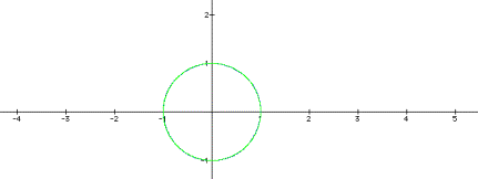
First of all look at the case where a and b vary together. The result is always the unit circle, as graphed below. In this graph a and b vary together as -1, 0, 1, 2 and 3. The graphs all overlay one another as the unit circle.
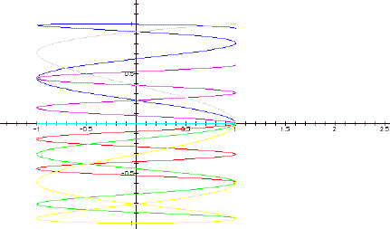
Next, look at the slightly more interesting case where a is held constant at 1, and b is varied through -1, 0, 1, 2, and 3.
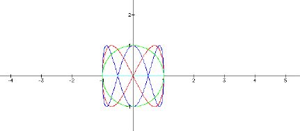
. In this graph (as in most that follow) the aqua graph is the line segment from (-1, 0) to (1, 0) generated when b = 0. This makes sense, since the y-coordinate is sin (0) for values of x as t varies from 0 to 2p. Another interesting item to note is that there is a purple circle “under” the green circle. The values of b for those two circles are -1 and 1. Since the circles overlay one another, we see that the sign of the value makes no difference in the shape of the circle – it merely changes the curve’s direction from clockwise for the negative value of b to counterclockwise for the positive b value. Finally, the red curve is generated when b = 2 and the blue curve is generated when b = 3. The “b=2” curve has 2 “loops” while the “b=3” curve has 3 “loops.” It looks like increasing b increases the number of loops in the curve, and increases the density. Note that the blue and red curves cross over themselves at the x axis.
What happens if we increase the value of a
and vary b? Here is another graph with a = 2 as b is varied through -1, 0, 1,
2, 3, 4 and 5. 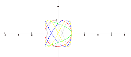
Once again, the purple and green with values of -1 and 1 overlay each other, but this time the curve is a parabola opening out from x = 1. The Cartesian equation of the parabola is 2y2 = -x + 1, while the parametric equations are x = cos 2t and y = sin t. Can we reconcile the two? Start with the parametric equations. Applying the double angle formula for x, we get
cos 2t = cos2t – sin2t; multiplying by -1 gives
-cos 2t = sin2t - cos2t; adding 1 to both sides gives
-cos 2t + 1 = sin2t - cos2t + 1, or
-cos 2t + 1 = sin2t - cos2t + sin2t + cos2t; simplifying gives
-cos 2t + 1 = 2sin2t or
-x + 1 = 2y2
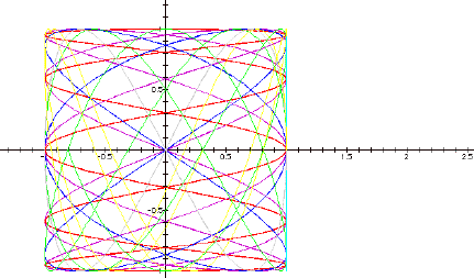
When b = 4, we see the nice bowtie shape we saw before when a = 1 and b = 2, so it looks like we get corresponding curves when a and b maintain a constant ratio. When b = 5 (blue) and 7 (gray), we get incomplete curves. When a is 2, we lose some of the nice symmetry we had when a was 1. As it turns out, the more symmetric representations occur when a is odd instead of even.
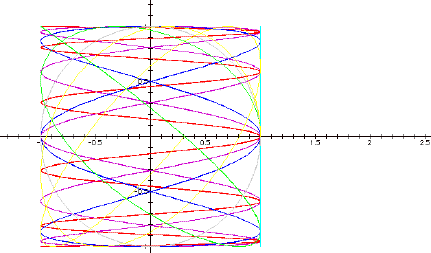
As b increases, the curve gets "kinkier.". What happens with bigger values of b? In this graph, the b values of the purple and red graphs are 10 and -10 respectively, while the blue graph is of b = 30, the green is of b = -45 and the yellow is b = 60.
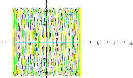
This is a big mess, but the earlier observation holds – that is, increasing values of b generate denser curves, and all the graphs cross themselves at the x-axis.
Here is yet another graph with a = 2. This time b is varied though small values between -1 and 1.
This is interesting because the graphs are horizontally oriented versus the vertical graphs seen with bigger values of b. Notice that each of the graphs are either above or below the x-axis. The graphs above the axis are the blue (b=.3), purple (b=.1) and gray (b=.5). The graphs below the axis are the red (b=-.1), green (b=-.2) and yellow (b=-.4). The aqua graph is along the axis and is the standard b = 0. So, with these small values of b, the sign does matter. Also, since these curves are broken (due to the iteration of t from 0 to 2p), it’s easy to see that each curve begins at (1, 0), which makes sense given the parametric equations. None of these curves cross themselves.
Let's move on to varying a while holding b constant. The first graph is of b = 1 for small values of a. Here the purple graph is of a = .2, the red graph is a = 1.1, the blue and green graphs are of a = .1 and -.1 respectively, the gray graph is a = .5, the yellow graph is a = .9 and the aqua graph is a = 0.
This graph is a bit of a mess. The aqua graph makes sense since the cos(0) is 1. The overlapping of the blue and green graphs shows that the sign of a doesn’t make a difference in the curve here. For smaller values of a (up to .5), the graph looks like a mutated sin wave. It also appears to be one half of the For larger values, .9 and 1.1, the graph more closely resembles a mutated circle. Notice that none of these graphs cross over themselves. The curves would probably have “closed” had t been iterated to 4p instead of 2p. Why do I think that? Look at the gray, green and purple graphs. Those look remarkably like half of the nice bowtie graphed when a = 1 and b = 2, though the purple and green graphs are “squished” against the y = 1 line.
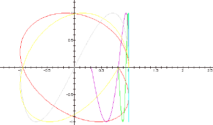
Finally, here is a graph of b = 1 with larger variations on a . The purple graph is of a = .5, red = 10, blue = 3, green = 1.2, aqua = 0, gray = 1 and yellow = .9.
The gray graph is the familiar unit circle, and the aqua line is what we’ve seen before. The blue graph is the vertical version of the curve we saw when a was 1 and b was 3. The green and yellow graphs show curves that cross over each other, but not along an axis..
Here is the same graph, except with b = 2.
This really throws a curve into the previous picture (no pun intended…). The red curve changed from a spiral to a “loop” picture (as described in the second set of graphs.) The unit circle has changed to a sine wave sort of curve. The green and yellow graphs now cross both on and off the x-axis. The blue curve now looks like a cross between the unit circle and the bowtie we’ve seen earlier.
That’s all I have! To extend these graphs, you could iterate for larger values of t and define when a larger value of t makes a difference. You could also vary coefficients in front of the sin and cos functions. Finally, switch the x and y equations to see what you can do with that. Does it make a difference? Have fun!