
Assignment 12: Exploring Graphs with Spreadsheets
by
Tom Cooper
In this assignment, we will examine ways that spreadsheets can be used to explore mathematical relations. The power of spreadsheets will allow us to represent relations algebraically, numerically, and graphically.
Let's begin with a simple function f(x) = x2 - 2. With Microsoft Excel, we can make a column of x values and quickly use it to create a column of f(x) values.
We can quickly generate a column of x values by using some of the built in powers of the spreadsheet. I wanted to look at data from -10 to 10, so I entered -10 into cell A2, saving row 1 for labels. I then entered " = A2 + 0.5 " into cell A3. The spreadsheet computed -9.5 for cell A3. A simple click and drag can finish out the column by always adding 0.5 to the value of the cell above.
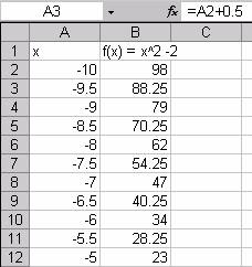
In cell B2, I entered " = A2^2 - 2." Then we can drag and fill in the f(x) column.
Once the two columns of data are set up, we can use the
plotting tools to create a graph. In Excel, simply highlight the two columns
and click on the chart wizard icon in the tool bar.![]()
I prefer to use a scatter plot with connecting lines but no points. (See the Excel Help menu for details.)
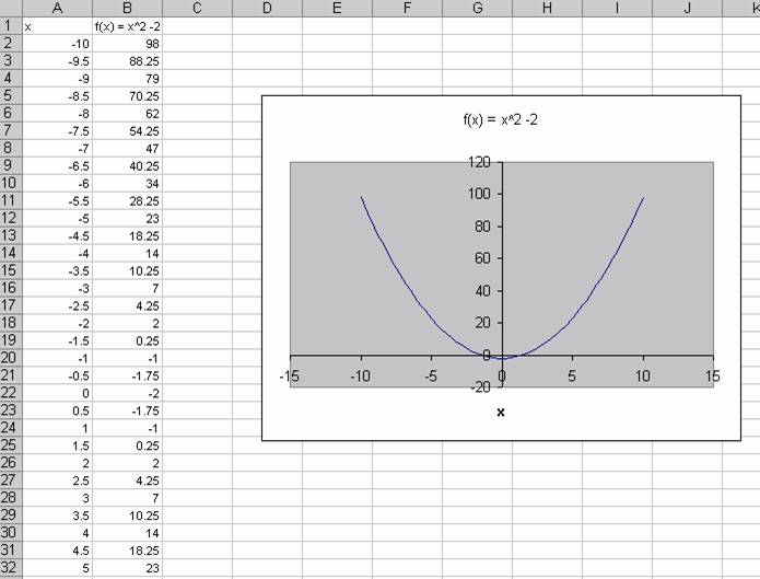
Now we have three representations of our function. We have the formula f(x) = x2 - 2. We have a table of values and a graph.
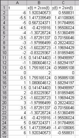
We don't have to stop with Cartesian graphs. We can just as easily handle parametric equations.
Consider the parametric equations x(t) = 2 cos(t) and y(t) = 2 sin(t). Here each coordinate x and y depends on a third variable t. We can generate a columns of x and y values given a column of t values. Since we have trigonometric functions, I chose to run t from -6 to 6.
Now we can select columns A and B to get a graph in the familiar xy- plane.
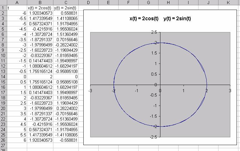
So again, we have formulas, numerical data, and a graphical representation.
If we use the relationships
![]() ,
,
we can even do polar equations. Let's try
![]() .
.
We'll need a column for the independent variable theta, a column for r, and columns for x and y to get a graph.
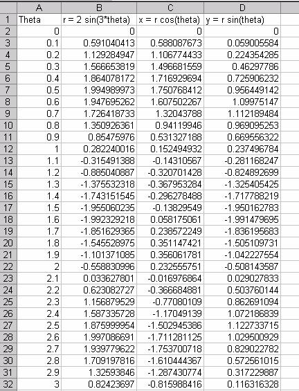
Plotting the x and y pairs gives us a polar graph.
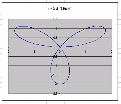
Thus we see that a spreadsheet can be a powerful tool for exploring the ideas of functions and relations. Students can explore the relationships between the different representations and develop deeper understandings.
Let's conclude with a problem that students might face in calculus.
Problem: Find the points with vertical tangent lines for
![]()
Partial solution: I will find one of them. We can estimate the location of one of these points on the graph.
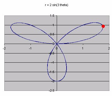
Students should recognize that this point is a local maximum for the x coordinate, and it is somewhere in the intervals 1.5<x<2 and 0.5<y<1.
We can explore this numerically with the spreadsheet data.
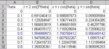
From the data, we see that this point is
approximately ay t = 0.5. We can be more accurate if we use smaller increments
of t around 0.5.
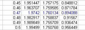
Using increments of 0.01, gives an estimate of t = 0.47. We can keep increasing
our accuracy if we want.
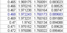
To three decimal points we can estimate the point at t = 0.468 as (1.760173, 0.889683).
This allows the student to explore the problem graphically and numerically which should increase their understanding and appreciation of using derivatives.
You can explore my examples in this Excel file. Can you find the other answers to my calculus problem?