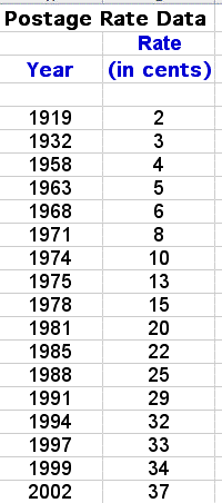
The data set includes the price of the 1st class letter postage stamp in the United States for the years 1919 through 2002. When will we have to pay $1.00 for a 1st class letter postage stamp? How about 64 cents? Also, can this data set help us predict when the next 3 cent increase of the postage stamp will be?


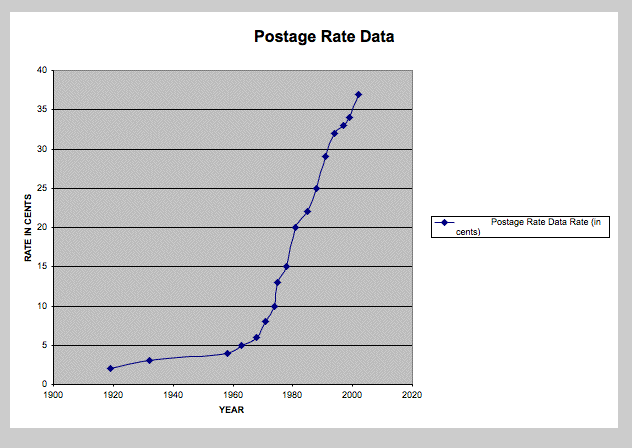
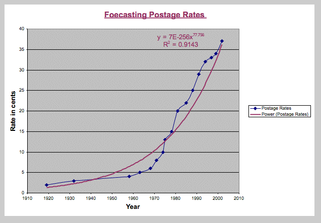
What does this data represent? Does this curve resemble a power function or perhaps an exponential function? Using Excel to graph the given data has advantages. Excel chart wizard will actually figure out a 'best fit equation' to for the data given.
The following function (equation) was calculated by excel for this 1st class letter postage rate data.

We can use this power function equation to forecast postage stamp prices and answer the questions:
When will the 1st class letter postage stamp = $1.00? 64 cents? have the next 3 cent increase?

The forecasted data starting at the year 2002 and projecting into the future till the postage stamp cost reaches $1.00 appears in the diagram below:

Using the Excel power function to forecast the cost of a 1st class letter postage stamp, we are able to project the following: