
The Problem:
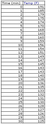
I investigated the temperature of a cup of hot water over the period of 30 minutes. The temperature of the room was 77 degrees Fahrenheit. I boiled the water in a tea kettle and then poured the water into a ceramic mug. The initial temperature was 191 degrees. I recorded the temperature every minute after that initial recording for the next 30 minutes. I used a kitchen thermometer that was not digital. I am sure there was error in my readings and the timing of my readings. However, these are the results I obtained:

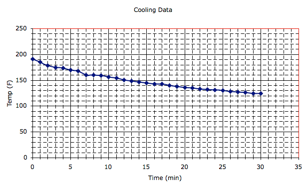
After collecting my data, I used Microsoft Excel to plot the points. Here is the graph of my cooling data:

Linear Model:
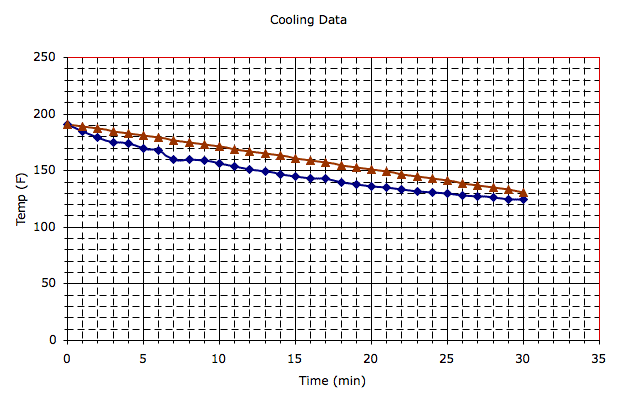
My first idea was to try a linear model. I did not think that a linear model would be the best solution but I felt I needed some perspective on how "straight" my data appeared to be. My first guess was the linear function y = 191 - 2x. Here is a how it compares to the data.

Next, I determined how accurate this model was by measuring my error. I found the difference between the model and the actual data, squared the difference, added all the differences together and divided by 30. I used Excel for my calculations. My measure of error was about 168. This supported my first inclination which was that this model would not work. I modified the model by changing the slope to see how close I could get it to match the actual data.The smallest measure of error I came up with was 36.05 with the equation y = 188.1 - 2.65x.
I thought that this experience with the linear model allowed myself, as student, to demonstrate my understanding of how the slope and y-intercept of an equation effect the graph of the equation. I was also able to see the changes in my table. Students tend to struggle with the relationship between tables, graphs, and equations. I think this activity forced me to strengthen my understanding of how those three concepts relate to one another. In my teaching, I have found that students struggle with the concept of slope. The more time they have to "play" with slope, the stronger their understanding becomes. I also believe that the more we ask our students to communicate the better. If you can explain your reasoning to another person, in that explanation you are strengthening your ideas. It also allows students to ask questions of one another (through the explanation process). The more questions we can answer and consider about our ideas, the better we understand the concept we are trying to know.
Exponential Decay Model:
I continued trying to model my data with a better measure of error. I experimented with the equation :
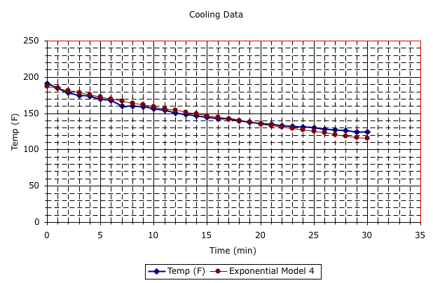
First, I experimented with the g. I set b = 191 because that is the y-intercept of the actual data. The best value for g that I could come up with was 0.984. This gave me a measure of error of about 26. This is an improvement over my linear model. So I continued experimenting by changing the b. I guess and checked values for b and kept g the same. The best equation I could come up with was
This equation seemed to be the best model because its measure of error was about 16.2. I also knew that this model was a good model because of the graph I produced with my data and this model.

Again, I think this experience is great for students. Exponential models are not given much classroom time but are important in understanding logarithms and exponents. I also think this activity strengthens students understanding of graphs, tables, and equations. The connection between those three big ideas (graphs, tables, and equations) is an important concept to understand as a student continues taking mathematics courses. I also think it helps our visual learner understand the equation and the more "algebraic" student learn to see the graph of what they are algebraically manipulating.