
Stamp Problem

To solve this problem, I used an Excel spreadsheet. I put the data in and then graphed it. I used my experience with graphs to choose a model. I decided the graph looked like an exponential growth curve.
Here is what the graph of the data looks like:
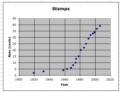

This shows that we started at two cents and double. To make sure we were doubling every 10 years, I took the year and subtracted it from 1919 (the start year) and then divided by ten. That let me know how many decades had passed. Here is this model graphed with the original data. The model is in pink.
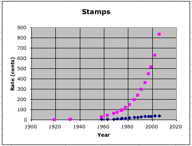
As you can see, this is a terrible model! This lead me to believe that the growth factor of the correct model had to be less than two. After spending some time guessing and checking, I felt comfortable with the following model:

Here is the picture of my model and the given data:
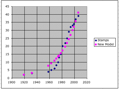
The original data is blue and my model is pink. As you can see it isn't perfect but it does a much better job than the previous model.
To answer when will the cost of a stamp reach $1.00, we need to plug into our model formula and solve. Remember our y is in cents and the x is the year, so we need to plug 100 in for y.
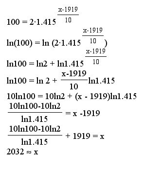
Thus, in 2032 a stamp should cost $1.00 according to my model.
To determine when the cost will be 74 cents, we need to plug 74 in for y.
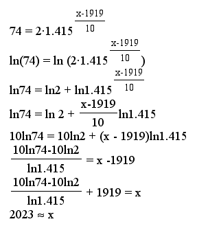
Thus, the cost of stamp should be 74 cents in 2023.