Spreadsheet Evaluation
By
Jeffrey R. Frye
This write up covers the initial stamp problem with the data
and questions asked in assignment 12 problem 12. I used an Excel spreadsheet to conduct my
exploration, in conjunction with a TI-83 plus graphing calculator. The initial data given was input into the
Excel spreadsheet as shown below.
Several different possibilities were considered to find the line of best
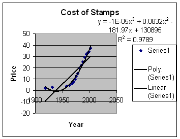
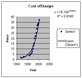
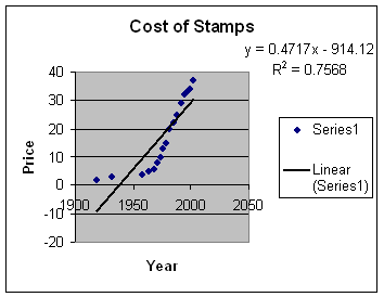
fit of the scatter plot that resulted from the year and cost data for stamps. The curves that I considered were linear,
exponential, and cubic. Based upon this
investigation, I determined that the power of 3, or cubic graph, gave the best
fit to the data. It also had the
highest ![]() value. The higher the
value. The higher the ![]() value, the better the fit is for the data. The different graphs are shown below. The data is also shown.
value, the better the fit is for the data. The different graphs are shown below. The data is also shown.
|
Year |
Price |
|
|
|
|
1919 |
2 |
|
1932 |
3 |
|
1958 |
4 |
|
1963 |
5 |
|
1968 |
6 |
|
1971 |
8 |
|
1974 |
10 |
|
1975 |
13 |
|
1978 |
15 |
|
1981 |
20 |
|
1985 |
22 |
|
1988 |
25 |
|
1991 |
29 |
|
1994 |
32 |
|
1997 |
33 |
|
1999 |
34 |
|
2002 |
37 |


To answer the questions posed in this assignment, I looked
at two different data sets. One set was
the data given above, and the other was using what seemed to be asked for in
the question. The question asked for
predictions based upon using the data for price of stamps from 1933 to 1996. Using this data, the cubic equation was still
the better predictor, having a ![]() value of .9877. The prediction for the cost of the stamp to
be $.64 is the year 2013. The prediction
for the cost to be $1.00 is the year 2030.
Finally, the next increase of $.03 was predicted to occur in 1996,
making the cost of a stamp $.35. This
result is ahead of what has occurred.
The cubic regression equation that is obtained is
value of .9877. The prediction for the cost of the stamp to
be $.64 is the year 2013. The prediction
for the cost to be $1.00 is the year 2030.
Finally, the next increase of $.03 was predicted to occur in 1996,
making the cost of a stamp $.35. This
result is ahead of what has occurred.
The cubic regression equation that is obtained is![]() .
.
When the data shown in the above pictures is included in the
analysis, a slightly different result occurs. The $.64 price stamp is predicted
to happen in year 2020. The $1.00 stamp
is predicted to occur in the year 2042.
The next $.03 increase was predicted to occur in the year 2003. Once again, it appears that the immediate
predictions are ahead of the actual result.
The equation and ![]() value are shown on the graph.
value are shown on the graph.
Explore this with Excel spreadsheet.
Return to main page