

Problem: Construct a graph of any function y = f(x) by generating a table of values with the x values in one column and the y values in another..
Excel is a tremendously useful software and I do not believe that enough children in school are exposed to it. I know that when I worked in the business world, the use of excel was widespread. From using it to create charts of data, to making forecasts for business models, the tool is of great help. I know that when I interviewed for the job, excel ability was extremely important. For those that believe that children need more real world learning experience, the use of excel can do that.
That all being said, Excel has its ups and downs as a mathematical tool. I will explore that here.
First, I will graph a simple y = x function. The data and graph is shown below:
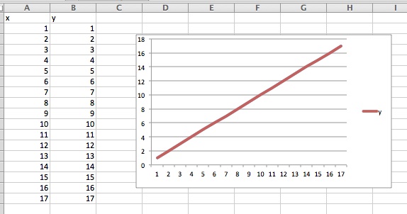
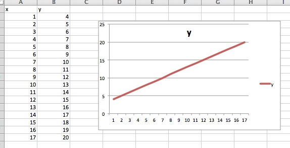
I chose a domain of x from 1 to 17, and alas the charting function was able to graph y = x rather easily. The same is true if you want to graph something like y = x+4 as shown below:
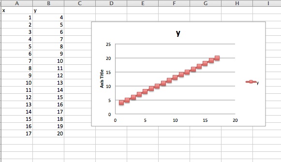
You can even change the style of graph. Here we have a scatter plot of y = x + 4:
So far so good for the linear functions with positive inputs. What if we made some negative inputs?

Whoops! What happened here? It seems as if the charting wizard doesn't like negative numbers that much, and starts the input values still out at one even though we really started at negative one. The axes can be changed, but it isn't all that intuitive on how to do so, and a student graphing this may get completely confused.
OK, so let's, for now, ignore negative inputs (Because, I mean, who would ever need a negative input!). Now I will attempt to graph a more complicated function, like y = x2. The graph is below (in both line and scatter plot form):

Well that looks pretty good now, It seems to have the shape and concavity that we would be looking for, as well as (of course) the correct data. But, the graph with the line does seem a little bumpy at spots. Let's investigate even more functions...
What about y = sin(x)? The data and graph are below.
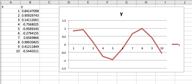
Well that looks...kinda... like what the sine function actually looks like. However, we are used to the sine graph being a lot more smooth than that, and a little bit more continuous looking, not so jerky.
Does this happen on other trig functions too? Look at the y = tan x output:
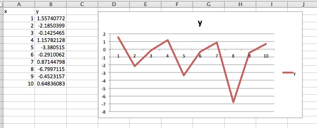
This graph does not look like a typical tangent function that you would see in a high school classroom. So what is going on here? Why are these trig functions behaving so badly?
Well, it seems like the problem even existed in the case of y = x2. Even there it seemed like there was a certain sense of jerkiness to the graph. This is the biggest problem with graphing in excel (at least when you are the one inserting the data). All that excel will do is put lines between the values of the outputs for each input. For example, in the case of y = tan x, tan 7 = .87144... but tan 8 = -6.7997.... Because it has no data between 7 and 8, it just puts a straight line between the output values. Thus the change in directions that occur "between the inputs" are not reflected in the graphs, resulting in the jerkiness. This is brought out clearly in trig functions because their values change in a manner that is not linear. In the case of y = x+4, it was OK for the graph to just put lines between intervals because everything is just a line.
But why is this really a problem? Surely we can get away with just graphing this way? Unfortunately, this could cause problems for students. Most students, it has been shown, are already pointwise thinkers, i.e. when given a function they will just plot points and connect the dots, not understanding or even caring that a lot may have gone on between those dots. Unfortunately, I think this spreadsheet program can enforce these ideas and give students some misconceptions.
Now, obviously, one could increase the number of input so that there is less space between input. However, excel only has so much space and a large number is destined to cause you even more time. Even then, you still aren't getting truly continuous data. This is an interesting thought, however, because even computer graphing programs can't be completely continuous because at some level they can only go to so many decimal places, and all the data between is missing. These types of problems are left to the numerical analysis people, and good luck to them!