
Assignment 12: Parametric Equations Explorations in Microsoft Excel
By: Mary Wisniewsky
We are going to explore the program Microsoft Excel. In this program, you can use spreadsheets to help sort data, make charts from a table of data, and it is a great tool for presentations and exploring mathematics.
In this assignment, we are going to explore how to insert data for sets of parametric equations with functions x(t) and y(t). However let's go over the basics.
In order to form charts for a set of data relating to a function or an equation, let's look at a basic equation:

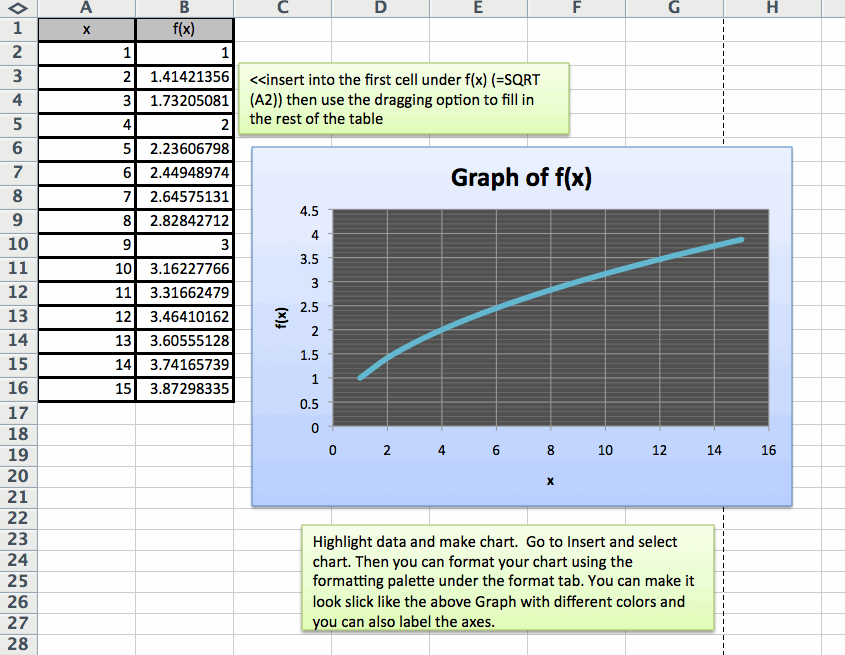
We need to make a table of values in order to generate a graph (chart). In your first column on your spreadsheet, insert your x values for the interval 1 ≤ x ≤ 15 such that x is a positive integer.
A quick short cut for inserting these values is in for the A1 cell, label it x, in A2 put in the first value 1, then for A3 type in "=A3+1" and press enter. This will generate the next number which is 2. Then highlight the cell box and drag it down until you have 15 values. In the first column, you should see the numbers 1 through 15 under the x label.
Below is a brief explanation of how to insert data for the f(x) column and to make a chart.
There are many functions that can be used to make a table of values and a chart to be visually represented.
This is a great tool to better understand the connection between a table of values for a function and its graph.
Now that we better understand how to enter in data and generate graphs for a function,
let's take a look at some parametric equations from Assignment 10:
1.) x(t)=cos t , y(t)=sin t
2.) x(t)=cos at, y(t)=sin bt
3.) x(t)=a cos t, y(t)=b sin t
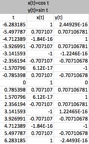
1.) x(t)=cos t , y(t)=sin t
When inputting these values, there should be three columns: t , x(t), y(t) and let the interval for be -2π ≤ t ≤ 2π.
Use the shortcut, "drag option" to help you with inserting values. Under x(t) next to the first value for t, insert "=COS(put in cell number here)" and similarly for y(t).
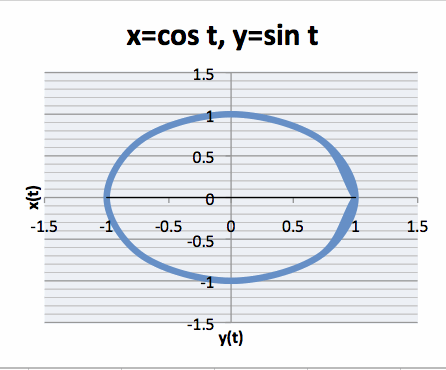
Once you have your table of values, highlight the data under the x(t) and y(t) columns to generate a chart for your data.
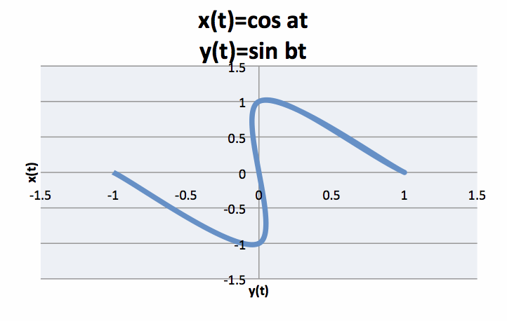
Similarly for what was found in Assignment 10, the graph is a "circle". When you stretch out the graph, it affects the shape of the curve.
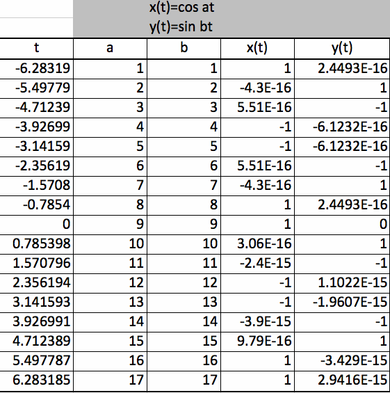
2.) x(t)=cos at, y(t)=sin bt
Add two more columns for this set of data (a and b). Use the drag option for all 5 columns to help generate data faster. Use the COS and SIN function tools again for the x(t) and y(t) columns.
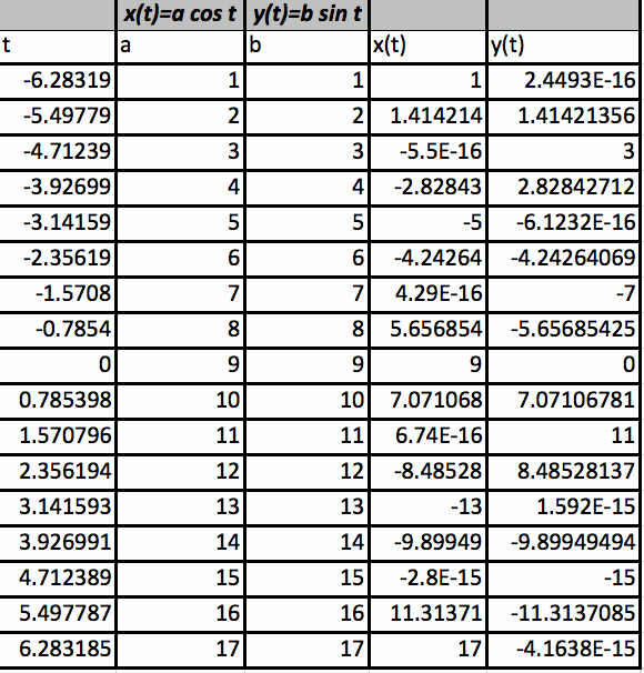
3.) x(t)=a cos t, y(t)=b sin t
Also here is the data of values for the last set of parametric equations.
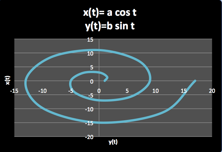
The above graph is just another example of how you can use the formatting palette for charts to change the look of your chart.
This application of Excel is just another tool to use to explore functions and their graphs.
*In comparison to graphs in graphing calculator to this, the shapes of the graphs are very different. In my opinion, graphing calculator is better tool, but when it comes to graphing specific data values, Excel can be an excellent tool.
Return to Mary Wisniewsky's Main Page