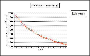

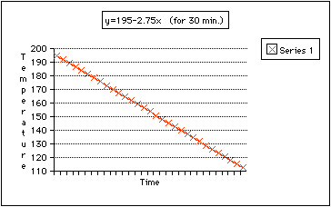
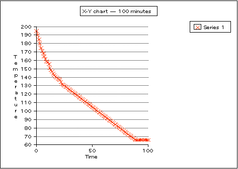
I tried matching an equation of a line to the data. The closest match (I thought) was with the equation y = 195 - (2.75x). Even that was not very close, the reason being that the temperature actually drops off quickly to begin with, approaches a steady change and then evens off. A line has a more constant drop. That graph is shown below.
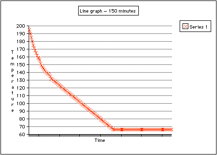
The next bit of data I applied was the room temperature at the time of
the experiment; it was 66° F. Assuming that the water would not become
cooler than the room temperature, I used the spreadsheet to predict the
time the water would be expected to reach 66°. Given the data, that
time would be after approximately 89 minutes. I graphed that data using
a line graph for time values up to 150. The last temperatures, of course,
remained 66° and probably would even after 300 minutes.
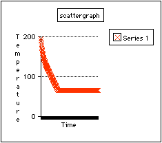
A scatter graph of the data looked very similar:
Then, I tried an x-y chart, which turned out to be very similar to the
line graph.
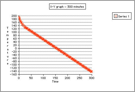
Now, if the data did not take into consideration the room temperature, then
the graph might continue to fall. I set up the data that way in the spreadsheet
to see what would happen. An X-Y graph shows the data looking more like
a "typical" line with the temperature reaching 0° at 155
minutes.
After doing this graph, I decided I did not like my choice of equation.
So I compared several times and values for different equations:

The first two times are actual times data was recorded. The next two and
the last are ones given in the assignment to predict, and 89° is when
the temperature was predicted to reach room temperature. The * represents
the room temperature. The equation y=195-1.5 seems to fit better. Here
is the graph:

Here is what happened when I took the sum of the squares of the differences
between the three equations and the data:

What appears to happen in the first column is that y = 195 - 2.75x would
be the closest fit with the data. For the first 30 minutes that may be
so, but over time (300 minutes), y = 195 - 1.5x may be the better fit.
Of course, I was looking at time values over 30 minutes, which is what caused
me to finally choose the latter equation. This statistic could be used
to refine the model for the data.
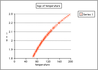
When I graphed the log of the data points, the graph looks, in shape, like
the graph of
y = logax.
Here is another one with the scales reversed:
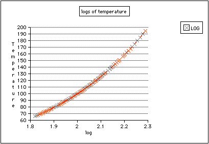
These log graphs seem better models than the graph of the lines because
they show better the gradual changes in temperature in the data. I made
several attempts to find an exponential equation to model the data without
success. The one I liked best can be found in the Write-up #5 folder under
"Exp. graphs, 2": y = [1 / (3^(x-10)] + 66.
The End.