

In this write-up we will explore using a Microsoft
Excel Spreadsheet to find the best function to fit the graph of
the stamp rates over the years.
Here is the data we will use in the exploration.
| Year | Rate(in cents) |
| 1919 | 2 |
| 1932 | 3 |
| 1958 | 4 |
| 1963 | 5 |
| 1968 | 6 |
| 1971 | 8 |
| 1974 | 10 |
| 1975 | 13 |
| 1978 | 15 |
| 1981 | 20 |
| 1985 | 22 |
| 1988 | 25 |
| 1991 | 29 |
| 1994 | 32 |
| 1997 | 33 |
| 1999 | 34 |
| 2002 | 37 |
Now, we will make a scatterplot of your data points in Excel. So, follow the directions below to create a graph.
1) Open the Microsoft Excel file with the stamp data by clicking here.
2) Highlight all of the data points at once by highlighting cell A3 through B19.
3) Go to the top toolbar and select View then Toolbars and then go over to Standard and let the mouse go. (You should have a second toolbar appear on the top or side of your Excel sheet.)
4) Click on the Chart Wizard icon on the toolbar. (Hold the mouse over the icon and it will tell you what it represents)
5) Highlight Scatterplot and choose the graph without lines on the right, then click Next.
6) Make sure "Columns" has a bullet beside it.
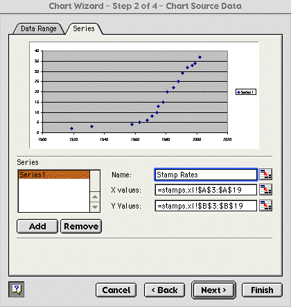
7) Click on the Series tab at the top of the screen.
8) In the Name: box type in Stamp Rates and make sure your X values: and Y values boxes are similar to the ones below.
9) Click Next.
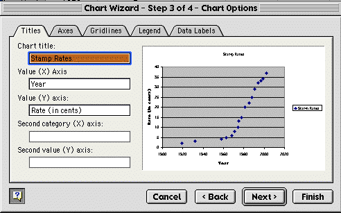
10) Type "Year" into the Value (X) Axis box and type "Rate (in cents)" into the Value (Y) Axis box. It should look like the one below.
11) Click Next.
12) Make sure As object in is bulleted and click Finish.
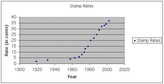
You should get a scatterplot graph on your Excel Spreadsheet which you can move around, enlarge, or shrink. Your graph should look like the one below.
You can double click on your chart to change the coloring and fonts.
Now, let's try to find the equation of the points on the scatterplot. If we find the equation, we can then estimate what stamps will cost next year, in 10 years, in 100 year, and so on.
Our first step is to determine if the points
look like they are forming a linear equation (y = ax + b), a quadratic
equation (![]() ), or an exponential equation
(
), or an exponential equation
(![]() ). The scatterplot above will never
reach zero, because it always cost something to buy a stamp. Since
the form of the points looks like an exponential equation and
we know the graph does not reach zero, we will use an exponential
equation to represents our points. So, we start with
). The scatterplot above will never
reach zero, because it always cost something to buy a stamp. Since
the form of the points looks like an exponential equation and
we know the graph does not reach zero, we will use an exponential
equation to represents our points. So, we start with
Let's explore some exponential equations on Graphing Calculator or using a TI-83 to become more familiar with them. First, let's look at when a=1 and b=1.
Next, look at the graph when a=3 and b=1 compared to a=1 and b=1. What happened to the graph? Solution
Next, look at the graph when a=1 and b=5 compared to a=1 and b=1. What happened to the graph? Solution
So, we know that a is the y-intercept and b is the steepness of the graph. We can use this knowledge to come up with an equation to fit our graph.
Steps to create the equation:
1) Since our first point we know that in 1919 a stamp was 2 cents, we'll let y=0 (for 1919 since no time has gone by at that point) and let x=2. Thus, we get the point (0, 2).
2) Our next point will be (13, 3) since thirteen years went by until it was 3 cents.
3) We'll convert our data points to coordinate points. So we get the following table with t=0 at 1919.
| year | rate(in cents) | Coordinate Points |
| 1919 | 2 | (0, 2) |
| 1932 | 3 | (13, 3) |
| 1958 | 4 | (39, 4) |
| 1963 | 5 | (44, 5) |
| 1968 | 6 | (49, 6) |
| 1971 | 8 | (52, 8) |
| 1974 | 10 | (55, 10) |
| 1975 | 13 | (56, 13) |
| 1978 | 15 | (59, 15) |
| 1981 | 20 | (62, 20) |
| 1985 | 22 | (66, 22) |
| 1988 | 25 | (69, 25) |
| 1991 | 29 | (72, 29) |
| 1994 | 32 | (75, 32) |
| 1997 | 33 | (78, 33) |
| 1999 | 34 | (80, 34) |
| 2002 | 37 | (83, 37) |
4) We know
the y-intercept is (0, 2) so we know in our original exponential
equation ![]() a=2.
a=2.
5) Let's choose
two values and substitute them into our new equation ![]() . We'll take (13, 3) and
(62, 20). You may choose other pairs and get a similar solution.
So, here are our new equations
. We'll take (13, 3) and
(62, 20). You may choose other pairs and get a similar solution.
So, here are our new equations

Now, we need to solve for b in both equations to make sure our b's are similar.
6) Solve.

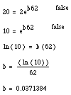
7) Now, we average the two b's and estimate that b=0.034.
8) Remember we also have to adjust the x since we set x to be the number of years after 1919. So, we'll substitue (x-1919) in for x in our equation.
9) So, our
new equation is ![]() .
.
10) Let's graph it along with our original graph to see how close we are. The graphs are shown below.
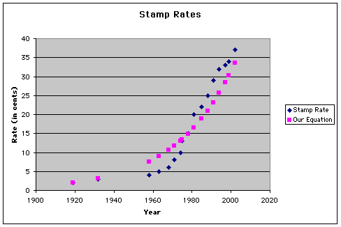
If we look at our graph, we can see that we are close, but not exact. In order to get a more exact equation, you could figure b for more points and average the b. This b may be more accurate than the b we used.
Here is an Excel Spreadsheet to find a more accurate b:
| x | y | b |
| 1919 | 2 | #DIV/0! |
| 1932 | 3 | 0.031189623700628 |
| 1958 | 4 | 0.0177730046297422 |
| 1963 | 5 | 0.0208247893607763 |
| 1968 | 6 | 0.0224206589524104 |
| 1971 | 8 | 0.0266595069446133 |
| 1974 | 10 | 0.0292625074988018 |
| 1975 | 13 | 0.0334250388732427 |
| 1978 | 15 | 0.0341508986532587 |
| 1981 | 20 | 0.0371384692418395 |
| 1985 | 22 | 0.0363317465575511 |
| 1988 | 25 | 0.0366047629609892 |
| 1991 | 29 | 0.0371409534642573 |
| 1994 | 32 | 0.0369678496298637 |
| 1997 | 33 | 0.0359405177039299 |
| 1999 | 34 | 0.0354151668007027 |
| 2002 | 37 | 0.0351538642419793 |
| Average B = | 0.0316499599509116 |
So, let's look at a graph with b=0.03165 compared to our given data.
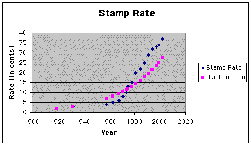
Well, this equation seems to fit better at the beginning of the data and our other equation seems to fit better at the end of the data.
Now, let's predict when stamps will be $1.00, $0.64, and $0.40.
I'll use our first equation since it fits the later points of our data better. So, substituting these values in for y give us the following predictions.
So, stamps will be $1.00 around 2043, $0.64 around 2029, and $0.40 around 2013. As you can see the increases are becoming greater as time goes by.
These dates may be a little later than what they will be in reality since our equation fell below the given data points.
Rounding also causes us to have some error in our equations.
Changing the y-intercept (a) may also give you a better graph.
Problem 1:
Find
the equation with (1971, 8) being the point on the y-axis. We
would have the equation ![]() . Is this equation
a better estimate than our other two?
. Is this equation
a better estimate than our other two?
Problem 2: Find another equation. Is this the best estimate?
Problem 3: Estimate when stamps will be $1.00, $0.64, and $0.40 with your best equation estimate.