

This write-up explores exponential decay using M&M's.
The activity can be done with students to introduce and promote an understanding
of exponential decay.
Steps to perform activity:
1. Break students into groups of 2.
2. Give each group one pack of M&M's (King size bag or bigger). The
bigger the bag, the more data will be collected for each group.
3. Make a table where the first column is the number of trials starting
with 0. Count the original amount of M&M's in the bag. This amount is
input for trial 0.
4. The second column is the number of M&M's left after the M&M's
that have the M showing are discarded.
5. After each trial, discard the M&M's that have the M showing. Then
replace the M&M's that are left into the bag.
6. Shake the bag.
7. Begin the trial process again until all M&M's are gone.
8. Evaluate the data using a spreadsheet or graphing calculator.
9. Find the curve that best fits the data.
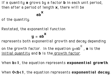
It is important to point out to the students that the growth factor cannot
be negative.
This activity specifically discusses when the growth factor, b, is
0<b<1.

The following data was collected on November 10, 1997 for demonstration
purposes. Then, the data was entered into Excel, a spreadsheet program.
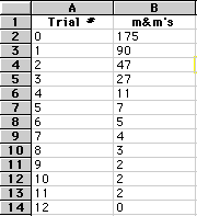
Our next step is to analyze the data and construct a function that will
model the data.
First, using the graphing tool in Excel, we can graph the data.
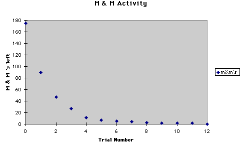
The graph is decreasing as the trial numbers increase until finally there
are no m&m's are left. The graph suggests an exponential function particularly
exponential decay. We know the equation for exponential decay is
We know a must be the initial amount of m&m's. So a=175.
Since the data and graph suggest decay, b must be between 0 and 1;
that is 0<b<1. Now to find b, we must employ our mathematical
reasoning skills. Allow students to try different values for b until a close
match is made between the given data and the curve that best fits the data
along with its associated data.
First, lets look at the rate at which b is decreasing and see if we can
come up with a reasonable growth factor. To accomplish this, take the y-value
and divide it be each preceeding y-value. We get the following data:

Notice for the first few trials the rate at which the m&m's left
are decreasing is approximately .50. About half of the m&m's remain
after each trial. So try the equation
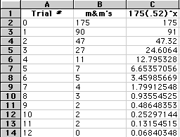
Using Excel, we graph this equation and compare the results to our original
data and graph to see if we have the function that best models the data.

Notice the new data is off as compared to the original data. The graph,
however, is fairly accurate.
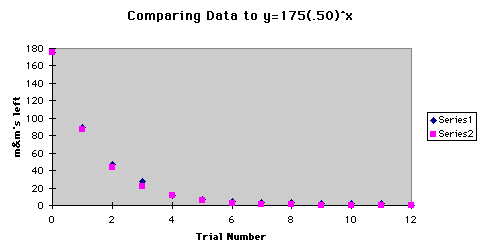
I do not feel comfortable with this equation as the funtion that best
models the data due to the results in the previous spreadsheet that compares
the y-values for each.
Here it would be helpful to allow students to try different values for b
to narrow down the discrepency between the original data and new functions
with different growth factors.
After trying different values of b such as b=.49-.56, there
were two functions that were up for debate for best function that fit the
data. When b=.51 and b=.52, the following data and graphs
were not sufficient for picking the function that best fit the data.
Consider the following comparison between the original data and data
for the new function.

The following is a comparison between the original graph and the graph
of the new function.
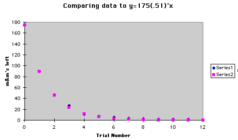
Consider also
and its corresponding data and graph.
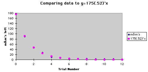
The following graph is representative of all three graphs.
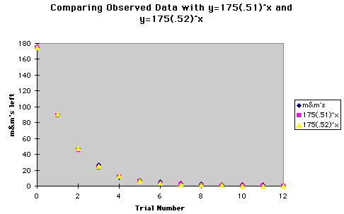
As you can see from the previos data and graphs, it is rather difficult
to make a decision regarding which of the two functions to choose as the
function that best fits the data. Our next step then is to calculate the
measure of error between the new models and the observed data. Then
compare the measure of errors and determine which one is the smaller of
the two.
To calculate the measure of error, take the square of the difference for
each trial, sum the squares, and divide by the number of data points. The
following spreadsheet shows the calculated error for each function.
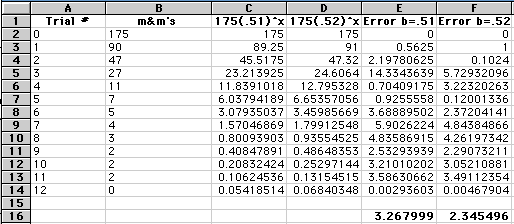
Using the calculated measure of error to refine our thoughts regarding
the appropriate function to choose reveals that when b=.52, the measure
of error is smallest, 2.345496<3.267999.
Hence, the function that best models the data is
The associated graph of this function is the following:

This activity can also be performed using a graphing calculator rather
than a spreadsheet.
A word of warning: With the graphing calculator, it is not necessary
to know any mathematics to determine the curve that best fits the data.
The student simply picks the type of curve they think it is, exponential,
and the calculator produces the equation that best fits the data. Students,
however, do not understand what the exponential equation suggests and means.
A word to the wise: Give students an opportunity to discover the
equation on their own by using a spreadsheet program first. Students have
to thoroughly understand the mathematics behind the exponential equation
to determine the equation that best fits the data. The students have to
understand each part of the exponential equation to make sense of what is
going on with the graph and how various changes with a and b
affect the graph.
After students have discovered the function that best fits the data using
the spreadsheet, then students can check this result with the graphing calculators.