Spreadsheets are tools that help us organize,
explore, and present various types of information. By using Microsoft
Excel, we can explore different types of mathematical data and
their graphs in the form of spreadsheets. We can consider the
following equations using spreadsheets and various types of charts
to view their graphs.
Microsoft Excel is a very useful program that can generate spreadsheets of data. There are many ways to enter data, and to manipulate the columns and rows that hold the data. For our purposes, we will focus on using the columns and rows of Microsoft Excel to generate x's and f(x)'s, or the ordered pairs (x, f(x)), for points to the graph of our equations. A typical Microsoft Excel spread sheet looks like:
The rows are numbered, and the columns are lettered to help organize our information.
When we have a mathematical equation we are exploring, we will only use the first two columns (A and B) and as many rows as necessary to create some useful values. First we begin by identifying column A as the column which will hold our x values, and column B to hold our f(x) values. As you will see below, A and B have been labeled "x" and "f(x)" for clarification. Many graphs can be viewed and explored in Excel as long as their equations can be written as a formula.
formula for x
We have already identified column A to be where all of our x values will be listed. The values of x are chosen as integers when possible and based on the type of equation to be graphed. As shown below, the values of x can range from positive and negative integers, as well as scalar multiples of pi when dealing with trigonometry functions. It is important to choose values of x appropriate for the type of graph that is being explored, for example it would not be helpful to choose x values for which the graph was undefined. Any x values you choose, however, can be adjusted easily.
It is most efficient to create a formula for generating your x values. Rather than typing in, each individual value for x, find a way to create all of the other entries, based on the first one you chose. For example, if we wanted our x values to be integers between -5 and 5, put -5 in the first row, column A (cell A1). Then, in the row below (cell A2), create a formula that will generate the next integer. So, in A2, write "=A1+1". This will produce the value -5+1, or -4. Just click on cell A2 and drag the corner of it down the A column to fill in the remaining rows.
This is helpful especially if you are investigating a hundred values of x! Imagine how much time it would take to enter those values one by one! Imagine how much time it would take to change each of the values if you wanted to explore a different interval of x values! It is helpful to create a formula to generate these values, so you can adjust the formula as necessary, not each individual value!
formula for f(x)
Now that we have our x values, creating the f(x) values is simple. The values for f(x) will all lie in the B column. So, cell B1 will be f(A1), and cell B2 will be f(B2), and so on. We must enter the given f(x) formula into cell B1. Simply replace all x's in the given f(x) formula with "A1" and Microsoft Excel will calculate the value for us. For example, if our given equation was f(x)=2x+3, we would enter "=2*A1+3" into B1. Since our A1 value is -5, our B1 value will be 2(-5)+3, or -7. This is how the ordered pairs (x,f(x)) form to make our graph. Click cell B1 and drag the corner down until all f(x) values have been defined for all chosen x's.
graphing
Since we have a table of x and f(x) values, we can graph these points. First, highlight all the data that should be graphed (all x and f(x) values), and then click on the graphing icon. A menu will show the options available for graphing data. Since we are investigating mathematical equations, it is beneficial for us to look at "scatter (XY)." These types of graphs will show us our (x,f(x)) points on a graph, and we can choose whether or not to connect these points with lines. the resulting graph can be modified for color, size, domain, range, and even line thickness. We are then able to modify the graph as necessary in order to best explore and present our equations. Bar graphs, pie charts, and many other types of graphs are also available to view any range of data.
examples
Click here to see and explore the Excel
spreadsheet file that was used to generate the tables and
graphs below. Each equation is graphed on a separate sheet, so
click the tabs at the bottom of the Excel page to view other graphs.
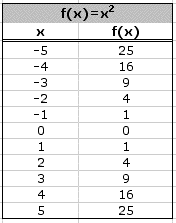
Here, our x values are chosen from -5 to 5. The formula used to create the x values is like the one described above. Since these charts are labeled, -5 is in cell A3. In cell A4, the formula "=A3+1" has been used to generate the remaining x values.
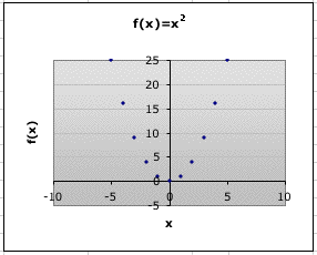
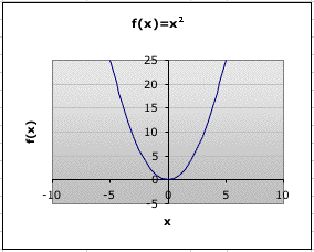
The formula for the f(x) values is first put in the cell B3, right beside the -5. In this cell, the formula was written "A3^2" to calculate all of the f(x) values, given the x's. Notice how the scatter plots show the graphs for this equation. Would the line graph be more useful to view than the graph of just points?
Click here to see another exponential function graphed in Excel.
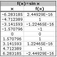
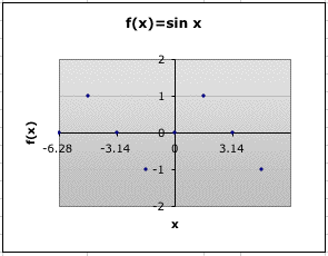
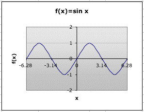
We can also use Excel to explore various trigonometric functions. Since we know the curve of sine is periodic, we should choose our values accordingly. Here x will go from -2pi to 2pi. First enter the value for -2pi in the first row of column A, in this case cell A3. Excel will calculate this value for us if we enter "=-2PI( )" into the cell. Now, we want the remaining values to increase by pi/2. So, in the next row, cell A4, we can write "=A3+(PI ( )/2)". Dragging this formula down will give us our remaining x values.
In order to get our f(x) values, enter the formula for our equation in cell B3, right beside -2pi. Simply plug in the given formula "=sin A3". Excel will then calculate the sin x, when x=A3. Drag this formula down to calculate the remaining f(x) values and graph. Make sure to choose appropriate values along the x-axis in particular, to see where our graph crosses the x-axis.
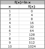
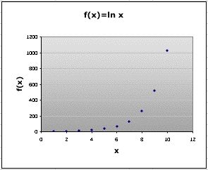
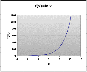
Similar to both equations above, we can enter logarithmic function into Excel to see it's graph. Here, x is chosen to be natural numbers to 10. If 1 is the first entry, in cell A3, how would the formula look in A4 if you wanted to generate the next natural number?
Again, a formula is needed to generate the f(x) values here. Use the first cell in the B column, right beside our 1, and enter the given formula replacing any x's with A3's. This formula looks like, "=ln A3". Drag the formula down to complete our f(x) values and graph. Notice how the range of this graph must be very large to see the function. What would happen if our range only went to 200?
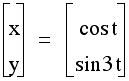
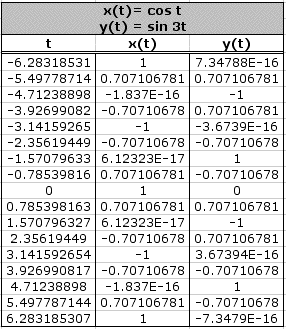
Microsoft Excel will even calculate the values and graphs of parametric equations. Since our equations contain trigonometric functions dependent on t, we will choose our t values to be from -2pi to 2pi. This time, however, we want to see more coordinated plotted, so our t will increase from -2pi in pi/4 intervals. So, once -2pi is entered into A3, we can put "=A3+(PI( )/4)" on the next row to calculate our next value of t. Dragging this formula down will give us all other values of t.
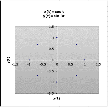
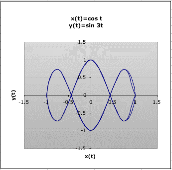
Parametric equations are different from those explored above because not only do they contain t, there are also two separate equations- x(t) and y(t). So we will need a formula, and a column of values, for each. First, f(t) can be obtained by entering the formula "=cos A3" in the B3 cell. Then y(t) can be obtained by entering "=sin(3*A3)" in the C1 cell. Here we are replacing t with A3, but the general process is the same. Now, drag both of those formulas down to get values for all our t's, and then graph. For parametric equations, the value of t is not graphed. Chose only the values in the x(t) and y(t) column to graph.
If only the graph of the points were shown, what would you conclude of the above parametric equations? Notice how the line graph shows more accurately the correct graph.