For several good description of statistics, see the resources page: miscellaneous topics
Classification of Data
Exploratory Data Analysis (EDA) uses graphs and numerical summaries to describe the variables in a data set and the relations among them.
Strategies for EDA:
Chapter 1 considers single variable statistics
Graphs for categorical (a.k.a. qualitative) variables:
1. Pie charts:
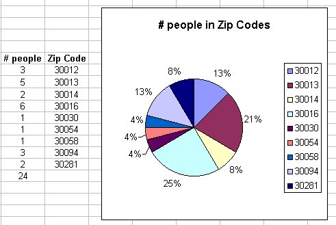
Here is the class separated into groups by zip code and graphed with a pie chart
Note that the area of each slice is proportional to the percentage of people in each zip code.
This chart was made with MS Excel.
2. Bar graphs:
Using the same data as above:
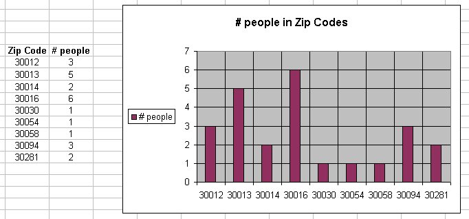
Note that the heigth (or area) of each bar represents the number of people in each zip code.
This chart was made with MS Excel.
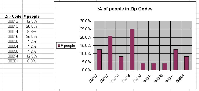
Note that the heigth (or area) of each bar represents the percentage of people in each zip code. Percentages are preferred for large data sets.
This chart was made with MS Excel.
These are limited in analyzing data since we can typically 'see' the same relationship among the numbers from the numbers themselves. In addition, for the pie chart we need to include all the categories that make up a whole and for the bar graph using percentages, you need the total number of observations. Often, we do not have access to the total.
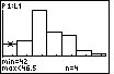
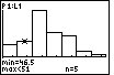
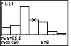
Steps in constructing a histogram:
Choose classes wisely. The class width affects the graph of the data. To see this effect, here is a java demonstration of how class width affects a histogram.
Percentages are preferred for large data sets.
Here are the steps in constructing a histogram using a TI-83 calculator.
NOTE: In order to be able to use the TI-83 calculator to construct a histogram, you need the actual observations and NOT the percentages of observations
Here are the characteristics of a histogram to consider:
We will be more specific about center and spread in section 1.2.
Skewed distributions:
The first step in determining if the distribution is skewed is to find the center, the max and the min. The center is found by counting through the number of observations until the half-way point is reached. However, suppose you are given the following histogram:
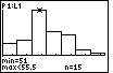
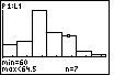
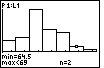
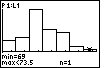
The above distribution looks skewed. To quantitatively determine the skeweness, count how many observations are in the above distribution by looking at the height of each bar. There are 43 observations. Thus, the center is at position 22. The 22nd observation is in the third bar of the histogram. The far-right observation (in the far-right bar) is further from the center than the far-left observation (in the far-left bar). Thus, the distribution is right-skewed.
Stemplots work best for small numbers of observations.
The Leaf is the final digit in each observation. The Stem is all the other digits
Steps in constructing a stemplot:
If there are too many digits, you may round the data.
You can split the stems (i.e., each stem appears twice). The upper stem will have leafs 0-4 and the lower stem will have leafs 5-9. For an example, see the top of page 17 of your text.
Back-to-back stemplots are useful when we wish to compare two related distributions.
Here are the steps in constructing a stemplot using a TI-83 calculator.
Time plots are used when data is measured over time. They can reveal trends, or other changes over time.
Here are the steps in constructing a time plot using a TI-83 calculator.
Preliminary examination of data sets:
Examination of graphs: