| Let's begin by entering the following data into list 1. | 112, 110, 107, 116, 120, 100, 118, 112, 108, 113, 127, 117, 114, 110,120, 120, 116, 115, 121, 117, 134, 118, 118, 113, 105, 118, 122, 117, 120,110, 105, 114, 122, 111, 112, 109, 105, 106, 104, 114, 112, 109, 110, 111,114 |
| We would like to get a better feel for how the data above is distributed. We will begin by creating a histogram of the data, then move to box and whisker plots. To start this process, press the 2nd button,and then the Y= button. Your sreen should look similar to the screen on the right. | 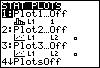 |
| Press enter, and your screen should now look like the following: | 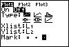 |
| Press enter to turn the stat plot on. Now press the down arrow once, and then the right arrow twice and press enter. Press thedown arrow and make sure that the Xlist option has list 1 selected. If L1 is not selected, then press 2nd,then the number 1 on your keypad. Use your down arrow again and make sure the freq selction is at a value of 1. One you have completed this, make sure your screen matches the one on the right. | 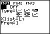 |
| In order to get a quick, and accurate picture of the data, press the ZOOM button, then press 9. Option 9 isthe ZOOMSTAT option which will automatically set your window for you. The final product is shown at the right. | 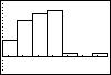 |
| Now use your TRACE button to find out information about your data. The information given is the minimum and maximium values for each interval, and the number of pieces of data in each interval. Move back and forth along the graph using the arrow buttons. An example is given at the right. | 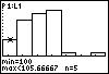 |