the most important
science in the whole world:
for upon it depends the practical application of every other
science and every art: the one science essential to all political
and social administration, all education, all organization based on
experience, for it only gives results of our experience.
The first part of the word statistic comes from the German word for state (staat). The word was used as a term to describe the practice of the state collecting information on births and deaths more than 300 years ago.
We see statistics in almost every medium: Newspapers,Radio, Television, and the internet. It is important for the audience of these media to have some knowledge of the rules and methods used in statistics to give us the results we see or read .
Many activities and interests today depend on statistics. Some of these are:
Examples of Statistics: Unemployment rate, consumer price index, rate of violent crimes, infant mortality rates, poverty rate of a country, batting average of a baseball player, on base percentages of a baseball player, salary rates, standardized test results.
Links of interest:
Journal of Statistical Education
Statistical Abstracts of the United States
Using a TI-83 to make Statistical Plots
There are three different kinds of data:
If each measurement of a data set is in one and only one category it is called qualitative data.
Categorical Data is qualitative.
Quantitative data are data values that can be measured on a numerical scale.
Counts and measurements are quantitative.
The first step in collecting data is to specify variable names for data you are interested in. The values of the variable are the data that has been collected.
For each case the variable has a certain value:
For example if you had a variable for the person's gender, the variable name might be gender and the values could be M for male and F for female. If the study was interested in the age of a person, there could be a variable named age which had numbers (ages) for the values.
In statistical packages or spreadsheets on the computer, data is usually arranged in tables. Each column contains the values for one variable. The rows contain all the data for a single case.
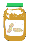 Click to see
Peanut Butter Data which will be used throughout this page
Click to see
Peanut Butter Data which will be used throughout this page
There are two ways we can collect data:
- Observation
- We can record things that we observe in the world around us.
- Experiments
- We can record measurements as the result of an experiment
Examples of Observational Data:
- the temperature outside at a given time
- the results of a political survey
- the number of people diagnosed with AIDS in a certain area
- the batting averages of baseball players
Examples of Experimental Data:
- growth of plants with fertilizer versus plant growth without fertilizer
- the ability of a drug to cure people
- the effect of fruits and vegetables on cancer
- the effect of sun on skin cancer
- the temperature of boiling water as it cools
- the measures of diameters and circumference of different circles
When we decide what we want to study, the population is the set of all elements we are interested in. It doesn't have to be people, it could be the set of all objects that you were interested in.
Example Populations:
- Every person in the United States
- Every person in your math class
- Every person in your school
- All the M&Ms in a bag of M&Ms
- All the M&Ms in the world
- A whole pot of soup
- All the blood in your body
Click here for an example of using a sample versus the population.
In deciding what kind of pizza to order for a birthday party, you may ask your friends what kind of toppings they prefer. This is a survey of your friends. The topic that you are interested in was the preferred pizza toppings. These are the two key ingredients of a survey. What you are interested in finding out and who should you ask.
- First you must decide what you are interested in.
- Next what questions should you ask to investigate your ideas.
- You must decide who to interview.
- You must decide who to give the interviews.
Example Surveys:
- Political Poll
- marketing surveys
- TV ratings
- Mall Surveys
Usually we cannot collect data from every member of the population we are interested in. We must find a sample that will accurately represent that population. We use the results of the sample to draw a conclusion about the population
Example of using a sample: A chef would taste a spoonful of soup to predict how the whole pot of soup tastes. What would happen if we just added salt and forgot to stir it?
biased sample: A sample that does not accurately represent the population. Biased samples can give inaccurate results. For example if you wanted to know the percentage of students at your school recycled, a sample of the ecology club would be a biased sample.
convenience sample: A sample that is chosen because it is easy. For example, if you wanted to see find out the percentage of students who ate the school lunch, and you just asked those people at your table if they ate the school lunch.
random sample: A sample that accurately represents the whole population. For example if you wanted to get a random sample of all the students in your school, you could put all of their names in a bin and randomly draw out however many you wanted in your sample.
systematic sample: A sample that is chosen systematically. For example if you surveyed every tenth person in a line.
voluntary-response sample: A sample you get when you ask for volunteers. For example if you had a survey on the internet. Those who answered would do so voluntarily.
Sample size: How big should your sample be? This is a question you must answer also.
 Try an experiment
with M&M's. Count all the different colors of M&M's in
one bag. Do you think this accurately describes all bags of M&M's?
Try counting the colors in another bag. Could you predict how
many red M&M's you would get from the number of red M&M's
in first bag? Get your friends to help. Count the colors in as
many bags as you can. Find the mean number of red M&M's in
a sample of size 5, 10, 12, and 15. Now compare the means. As
your sample size gets bigger the sample will more accurately describe
the population, but you must also not choose a sample size to
big to realistically carry out the survey.
Try an experiment
with M&M's. Count all the different colors of M&M's in
one bag. Do you think this accurately describes all bags of M&M's?
Try counting the colors in another bag. Could you predict how
many red M&M's you would get from the number of red M&M's
in first bag? Get your friends to help. Count the colors in as
many bags as you can. Find the mean number of red M&M's in
a sample of size 5, 10, 12, and 15. Now compare the means. As
your sample size gets bigger the sample will more accurately describe
the population, but you must also not choose a sample size to
big to realistically carry out the survey.
Click Here for an example of a sample vs. population
![]() Have
you ever heard the phrase a picture is worth a thousand words?
Well, this holds true in statistics if we say a picture is worth
a thousand numbers.
Have
you ever heard the phrase a picture is worth a thousand words?
Well, this holds true in statistics if we say a picture is worth
a thousand numbers.
Once data has been collected we must look at the data in different ways in order to find the information they contain. The following terms are various ways of looking at pictures your data.
In some of the following graphs or plots, the peanut butter data mentioned earlier, will be analyzed. The data originated in a consumer products study. The variables in the data set are:
- Name: Brand Name of peanut butter.
- Quality: A rating from 1 to 100; a higher number indicates a higher quality.
- Sodium: Sodium Content per serving.
- Price: Price per serving.
- type: Is the peanut butter a natural or regular brand?
- style: Is the peanut butter creamy or chunky?
- brand: Is the brand of peanut butter a brand name or a store brand?
A bar graph is a visual display of data that falls into categories. In the example below, the sports activities the people participated in could be put in the categories of exercise, walking, swimming, bicycle riding, etc. The bars can either be horizontal or vertical. Different groups can be indicated using different colored bars, or bars with different patterns.
Example of a bar graph comparing two groups where the bars are vertical.
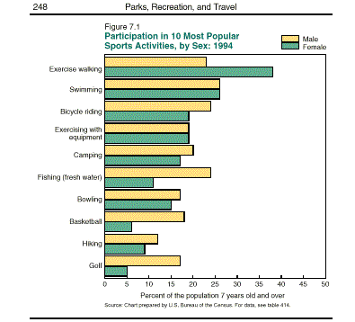
Click here for instructions on creating a bar graph.
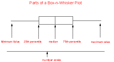
The box-n-whisker plot is good at showing the extreme values and the range of middle values of your data. The box shows us the middle values of a variable, while the whiskers stretch to the greatest and lowest value of that variable.
The Box-n-Whisker plot was invented in the 1970's by John Tukey. In the 1960's John Tukey also invented the Stem-n-Leaf plot.
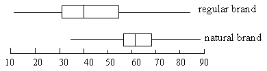
This type of graph is useful comparing one variable for several different groups. A box plot of that variable can be drawn for each group on one page, giving you a visual representation of the differences of that variable according to group. For example: The poverty rate of different countries might be compared by looking at the box-n-whisker for that country in relation to the box-n-whisker graph of the poverty rates of the other countries.
It is sometimes called the Five-number summary, because it uses five summary statistics for a certain variable. These summary statistics are
- the middle of the data when it is arranged in order from least to greatest, think of splitting the data into two equal groups.
- the Box portion of the Box-n-Whisker plot includes 50% of the data
- the whiskers extend to the minimum and maximum data values
- more than one box plot can be drawn for the number scale allowing comparison of a variable by groups
To see an example Box-n-Whisker plot of Hitting Averages for the Braves and YankeesClick Here
Example Box-n-Whisker Plots:
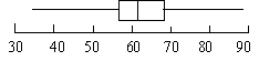
Quality Ratings of Natural Peanut Butters:
Comparing the Quality Ratings for Natural/Regular Peanut Butters:
To see a step-by-step guide to creating the above Box-n-Whisker plot Click Here
A circle graph shows how parts relate to a whole and to each other. The area of a sector indicates the percentage of the whole of a part.
Example Circle graph: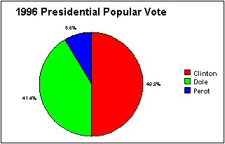
To see how this graph is made click here
Frequency
The frequency of a variable is a count of how many times a certain data value occurred for that variable. For example, if your variable was Gender, you would count the number of males - this would be the frequency of males. Then you could count the number of females in your data set giving you the frequency of females.
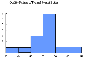
The frequencies of a variable can be displayed using a histogram.
For example in creating a histogram of the quality ratings of natural peanut butter:
| 34.00 | 40.00 | 52.00 | 57.00 | 57.00 | 60.00 | 60.00 | 63.00 | 67.00 | 69.00 | 69.00 | 69.00 | 71.00 | 89.00 | Quality Rating |
| Range Quality Ratings | Number in Range (frequency) |
| 30-40 | 1 |
| 40-50 | 1 |
| 50-60 | 3 |
| 60-70 | 7 |
| 70-80 | 1 |
| 80-90 | 1 |
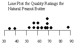
Line Plot
A line plot, sometimes called a dot plot, helps use get a better understanding of a small number of observations. A line represents the variable you are interested and the values of the variable are labels on the line. Each observation is marked as a point above the line.
Example of a line plot:
To see a step-by-step guide to creating the above Line plot Click Here
Scatter Plot
Sometimes we want to see how changing one variable affects another variable. A good way to visualize the affect of changing one variable on another is the scatter plot.
A scatter plot displays the data for two variables.
Most spreadsheets will create a scatter plot of the two variables we have chosen.
Many times we will be interested in the changes of a variable over time such as the concentration of carbon dioxide in the atmosphere. We would plot concentration of carbon dioxide over time.
In our Peanut Butter Data we might want to know if price is determined by the quality rating. Does the price of a peanut butter increase with the quality rating? A scatter plot can show us the relationship of price and quality rating:
Peanut Butter
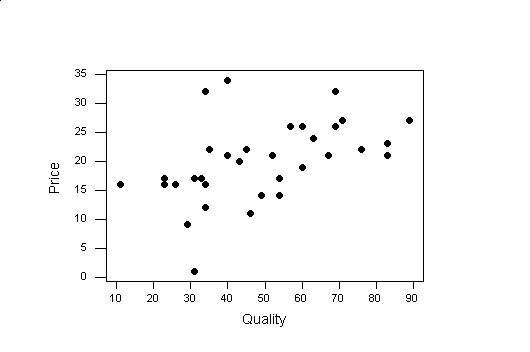
To see how to create the above scatter plot Click Here.
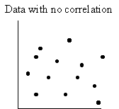
When we look at a scatter plot of two variables, if we could draw a straight line with a ruler close to most of the data, we would be able to predict the value of one variable based on a value of the other. What does line of "best fit" mean? Most statistical packages use the method of least squares. This method uses the data to find the line of best fit by minimizing the sum of the squares of the distances of the data points to the line. The squares of the distances are used since the distance might be a negative number, but the square of the distance of the point to the line will be positive. An examples of the distance of the point to the line is indicated by the red lines below. The equation of this line can be found from the data
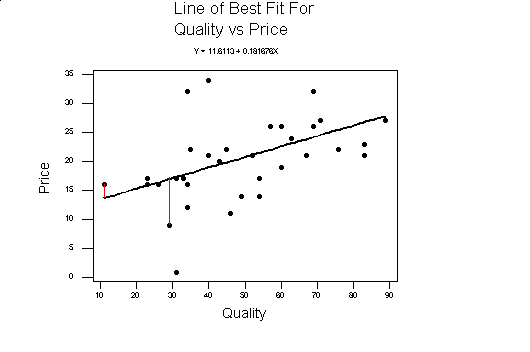
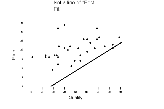
Compare the above graph to the one below. Although the line below goes through two of the data points, all the rest of the data is above the line, where in the line above the number of points above and below the line are nearly equal.
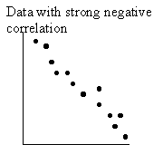
If most of the data points are close to the line of best fit, the two variables are said to be highly correlated, otherwise they are weakly correlated. If the slope of the line of best fit is positive (going up from left to right), the two variables plotted are said to be positively correlated. If the slope of the line of best fit is negative (going down from left to right), the two variables being plotted are said to be negatively correlated. In the example the quality and price are positively correlated.
Stem-n-Leaf Plot
This display shows all the data values. You can determine the shape of the data.
The stem is the first digit of the data (the leftmost digit) and the leaves are the digits to the right of the first digit of the data value.
The Stem-n-Leaf Plots was invented by John Tukey in the 1960's. John Tukey also invented the Box-n-Whisker plot in the 1970's.
It may become hard to create a stem-n-leaf plot if you had a large amount of data. A histogram would be an easier choice. The histogram, like the stem-n-leaf plot shows the shape of the data, but unlike a stem-n-leaf plot, you can not recover the data from a histogram.
Click here for example of Stem-n-Leaf Plots with different shapes.
Example Stem-n-Leaf Plots:
Quality Ratings for Natural Peanut Butter:
Stem Leaves 3
4 4
0 5
2 7 7 6
0 0 3 7 9 9 9 7
1 8
9 Key
means 34.
3 4
All the data can be recovered from this plot by putting the stem and leaves together:
34,40,52,57,57,57,60,60,63,67,69,69,69,71,89.
Comparing the Quality Ratings of Natural and Regular Peanut Butter with side by side Stem-n-Leaf plots:
1 1 2 3 3 6 9 3 4
3 1 1 3 4 4 5 0
4 0 0 3 5 6 9 2 2 7
5 4 4
0 0 3 7 9 9 9
6 0 1
7 6 9
8 3 3 Key
means 11
1 1
To see a step-by-step guide to creating the above Stem-n-Leaf plot Click Here
A histogram is a bar graph that shows how many data values fall into a certain interval. The number of data items in an interval is a frequency. The width of the bar represents the interval, while the height indicates the number of data items, or frequency, in that interval.
Histogram gets its name from "Histo" - meaning mast or beam and "gram" - meaning picture.
The intervals for a histogram can be chosen by the following:
To see a step-by-step
guide to creating the above Stem-n-Leaf plot
Click Here